

Creating Media since 2019.
Menu
Contact me
Marie Cabibihan
mari10@sherborneqatar.orgYEAR 12 | 2022
FF Din is one of my favorite san serif fonts, it's unique and stylistic, this sophisticated style is both regular and clean while still sustaining class and elegance. FF DIN is thin and lightweight, it comes with a variety of choices, there are 20 different weights, with a rounded version and provides advanced typographical support and is packed with features that include, but are not limited to, case-sensitive forms, fractions, super- and subscript characters, and stylistic alternates. This is perfect for curating brand identities and setting my brand apart from others.
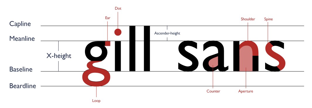
Gill sans is a very versatile font, many designers, myself included enjoy its classic tone and simple concept. This humanist san serif font will fit nicely as a headliner as it's casual and welcoming. It's not very intimidating nor is it too pretentious and loud, in turn, will lower the possibility of repelling the more easy-going or relaxed audience.
BW Mitga is a playful san serif font, although an underground font, BW Mitga is one of my most favorite fonts because of its style and uniqueness, each weight is tilted at a 16 degree angle and is shaped in such a way that is so alluring and hypnotizing to me. The varying angles add layers of intrigue and unpredictability rather than staying linear and repetitive like all the other fonts. Although there isn't much information on Wikipedia (as the font isn't very well known) I still consider Mitga as one of my best choices because of the personality it brings on the page.
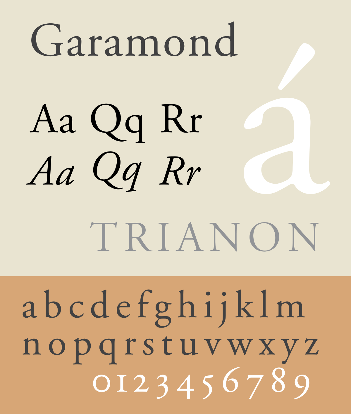
When I was looking for a possible serif font, I stumbled over Garamond and Bodoni, both being some of the most popular fonts in the industry. However, I think Bodoni would be a better elegant fit because of how condensed the letters are compared to the wider Garamond font. I also believe that this font has more recognizable, curvier strokes and as a result offers a more powerful and sophisticated tone.
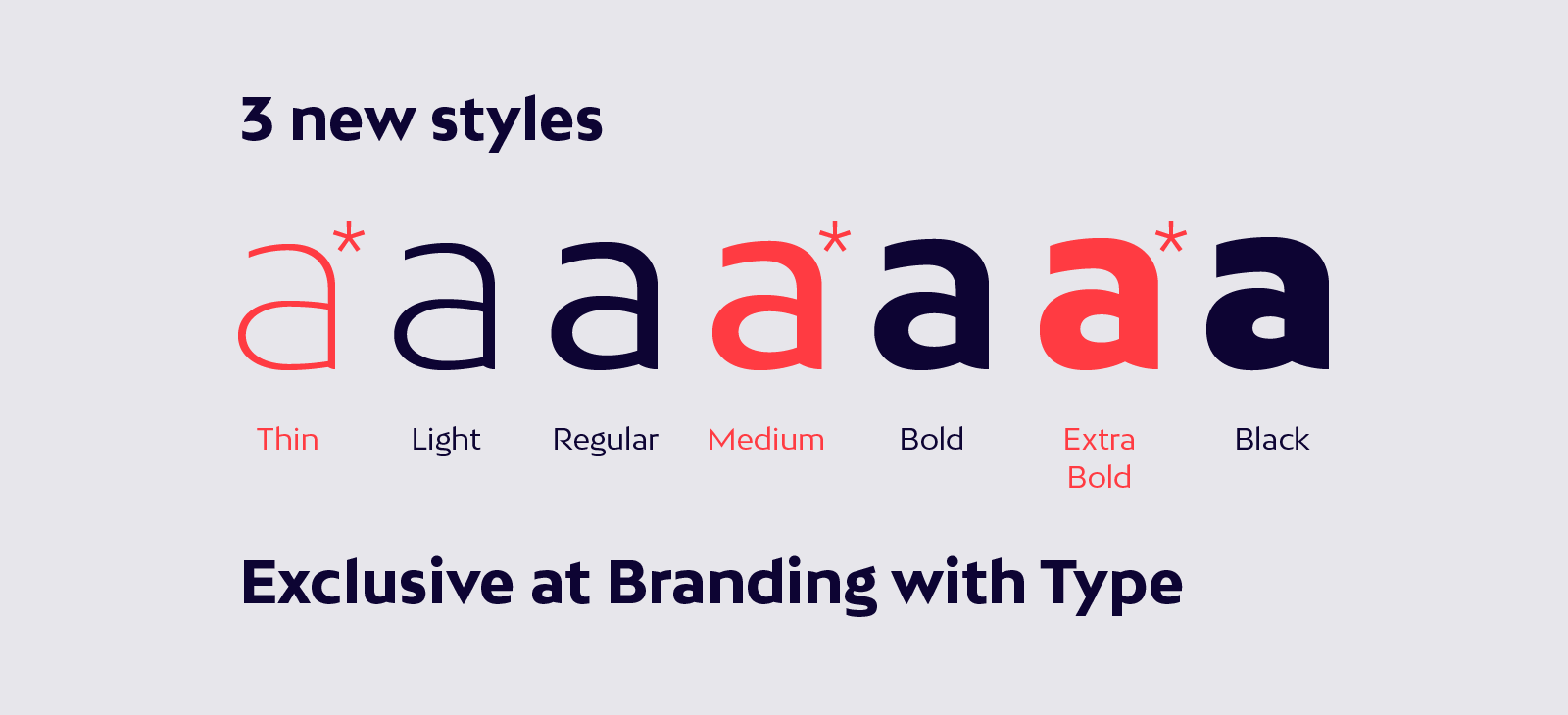
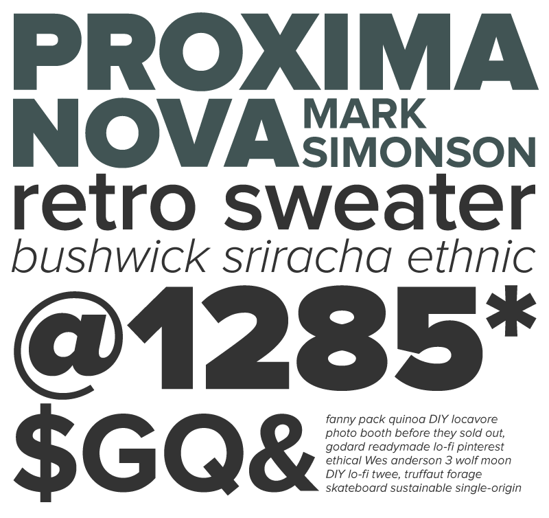
Proxima Nova is widely used everywhere on the internet, this is largely because it can supply 48 different styles; 7 weights each with matching italics, small cap styles, and condensed/extra condensed widths. This is a large asset in the design community as it means lots of customization at one's disposal. As of now, Proxima Nova is used in over 25,000 websites, it achieves this by melding humanistic proportions with a geometric appearance and its customizability making it perfect to use in any medium as basic body text.


.png)
Some of these content pages are hard to achieve compared to the spreads, they require more skill and patience.