Contents draft 1
The contents page is a stylistic take, the colors are brighter and cuter. It is more streamlined and corporate. This was very different from the first as I had to draw each component despite never drawing digital art from scratch. In my previous spread that I had done before this, the anime styled one, I was simply editing and mixing what I had, putting in some effects and drawings in the process. This time, it was fully made from scratch, even if I didn’t intend for it to be this way, I am slightly happier with this piece than the last.
I started with filling in all the little details that would have been a background if I had proceeded with the original idea. Soon, it morphed into a real illustration, with characters, shapes and colors not taken from any presets. This was refreshing as I never believed I would be able to do this, in fear of it not meeting the standard I had curated from viewing many works over time. Although I am very far from their level, this relinquished a few of my doubts on my abilities.
In terms of the technical aspect I used custom brushes and a color palette I improvised, using colors from various other palettes and presets I had downloaded in the past.
The only regret I have is that it did not look as I planned, meaning I could never see my vision of it flourish into reality even though I had a clear image of what it would look like. I don’t think I have the real skill to make it as I imagined, so I think this is okay. The result that came out may have been even better than the vision since this expressed my median capabilities. This was also the first drawing I have ever improvised, coming up with ideas to fill in the gaps without using my foresight to plan everything ahead. This was all too new to me, I hadn’t anticipated what it would look like as a whole, each stroke walking towards the mystery that is the future. The finished piece is quite pleasing for me.
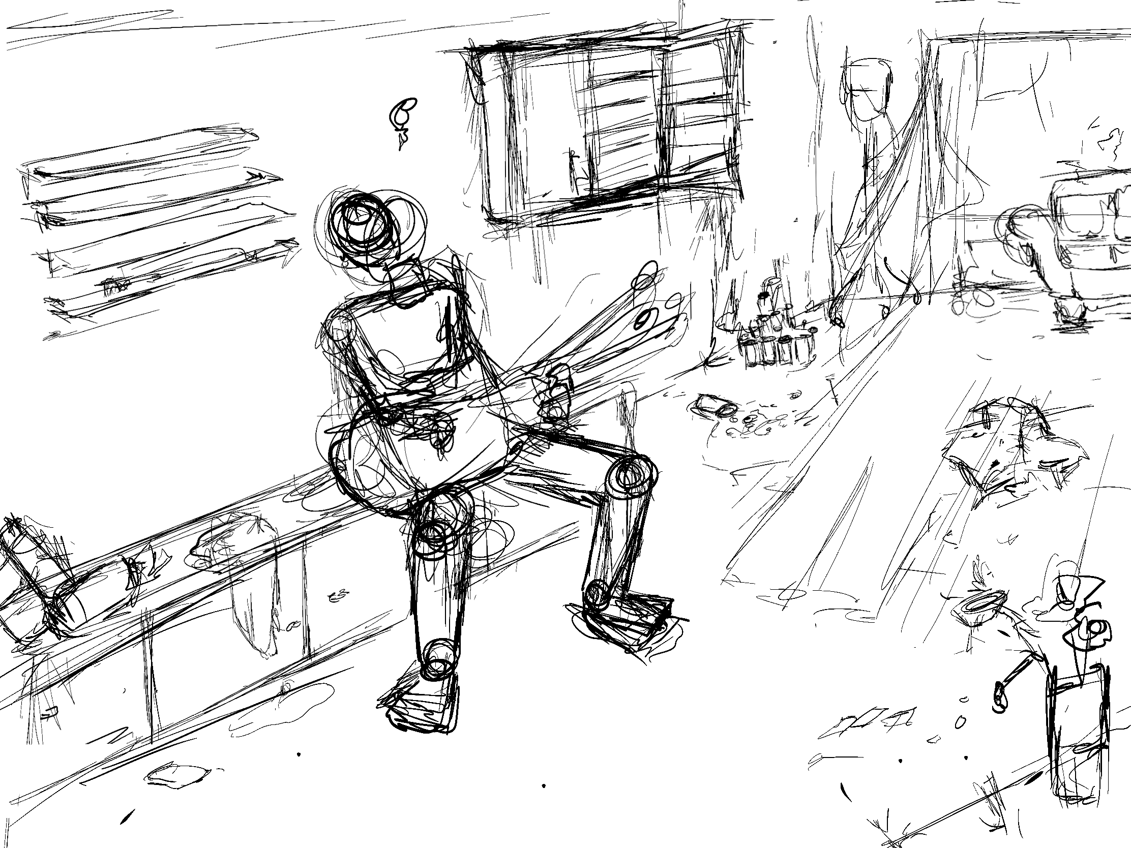
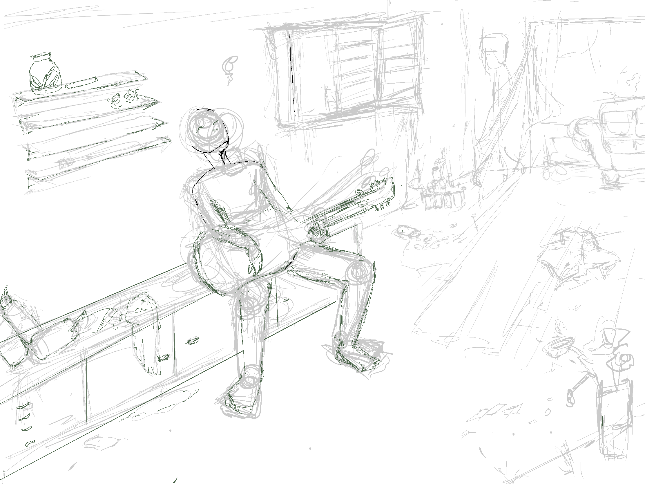
Contents draft 2
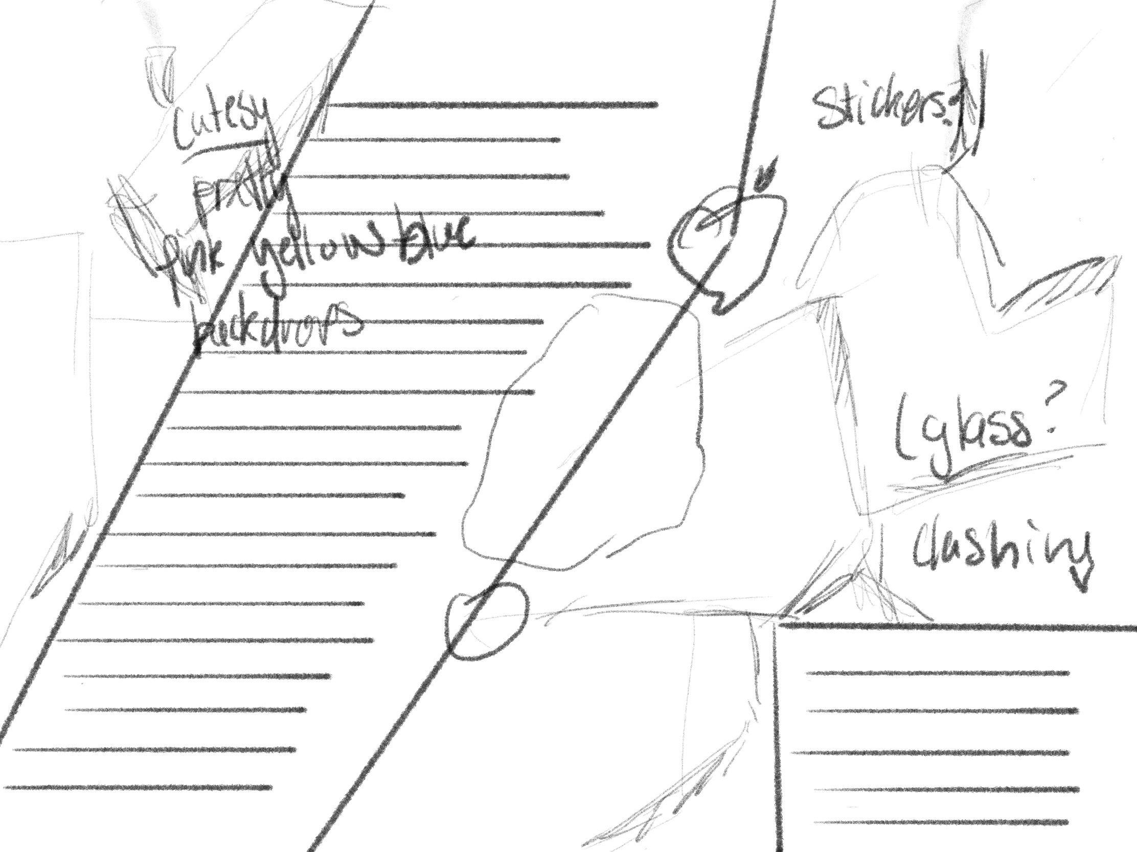
This second contents draft was planned with reference to the magazine I had previously studied in "Magazine Research." At first, I thought to encapsulate the same feeling as my previous content draft; bright colors and lively, interactable elements. It was hard not to fall into that trap of mimicking similar styles after building that confidence with my previous draft. However, I had changed plans halfway through. I suddenly realized how hard it would be to mimic the style I was emulating without it looking like plagiarism; I wasn't sure what to put on it and couldn't visualize where the piece would go due to the limitations of the reference. In fear of having little control of what it would like, I scrapped the piece in favor for a different style of art, a more playful, anime style with a person as the subject. This would be my first time taking line work seriously, a large milestone and would serve a greater purpose later in the future for my spread and cover. I didn't want to commit too much into this piece before exploring other areas so I solidified the sketches and linework, albeit messy due to my inexperience, and moved on to the next piece.


Although I was really pleased with the final outcome and was ready to continue rendering, I decided it wasn't worth it as the composition was lackluster and not fit to be a contents page. Furthermore, my fear of rendering continued to expand, at this point in time I hadn't fully rendered anything and was scared to begin. I wasn't sure what to do. I was far too inexperienced to try, afraid that the gap between my skill and vision would be too large that it would look horrible. Though I wanted to try, I was too scared of ruining it and abandoned the piece reluctantly. Afterall, this was my first time exploring clean line art, a sentimental piece that I didn't want to ruin with my inexperienced coloring.
Contents draft 3 (practice)
I began, with new experience under my belt, I started drawing again, inspired by art on Instagram, I tried to sketch out a full body with a background. To me, this felt like a simple drawing exercise after inspiration. The pressures of creating a final piece were not apparent during the time of making this. I experimented with perspectives, poses, linework and composition. Though this was surprisingly easy to do, I was still scared of what would happen if I were to add text or begin shading. I was still scared of what the final contents page would look like, I hadn't even started nor did I think any of my previous pieces were good enough to be the final contents page, either too messy or too plain. I vented this frustration on this piece since the stress was really starting to get to me knowing I had nothing to show for my contents page and I still hadn't done my spread. I didn't even know how long it would take and the deadline was approaching rapidly. I had to let go of this piece and start soon. What started off as a carefree exercise left me stressed and incredibly frustrated.
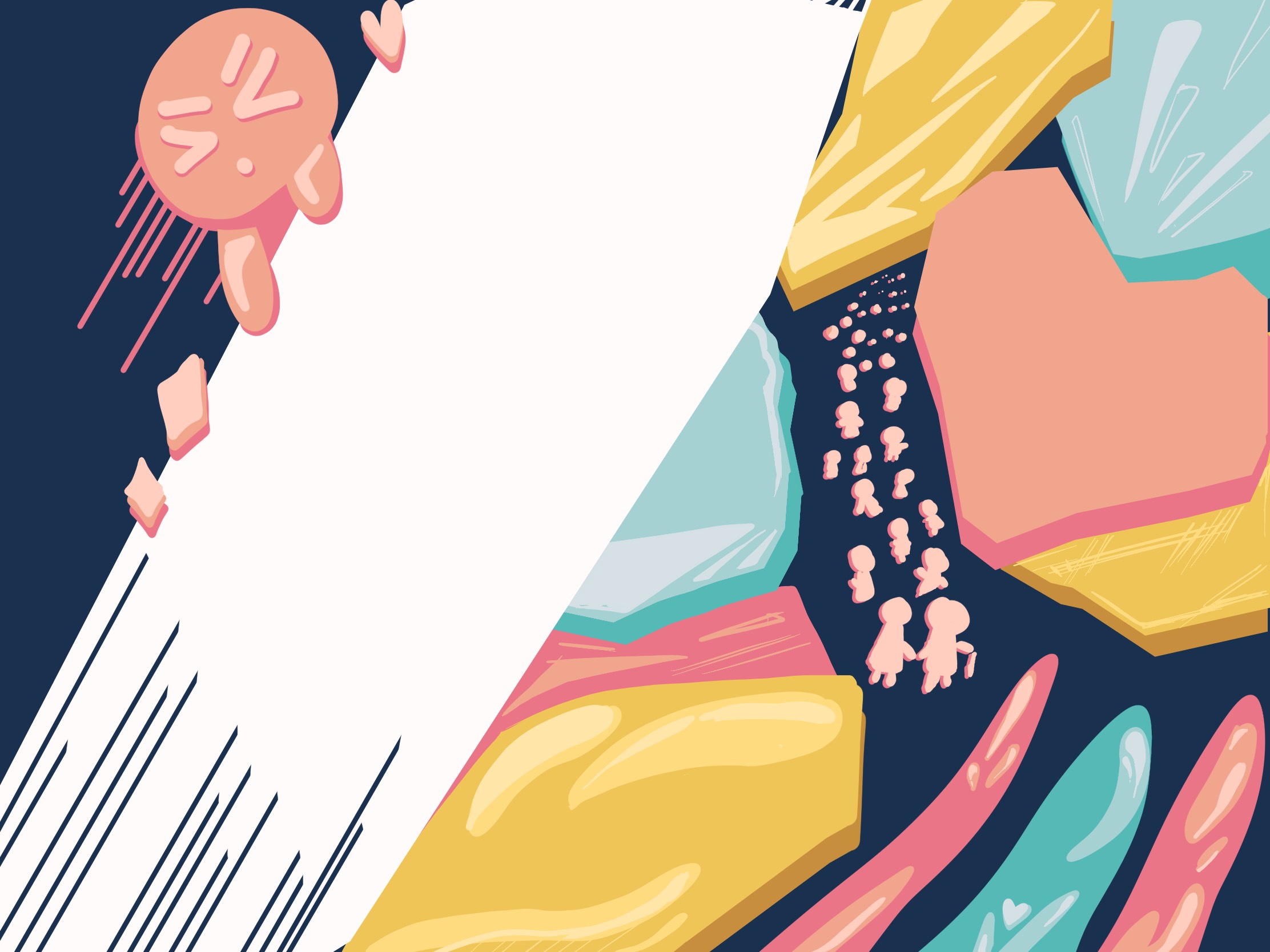
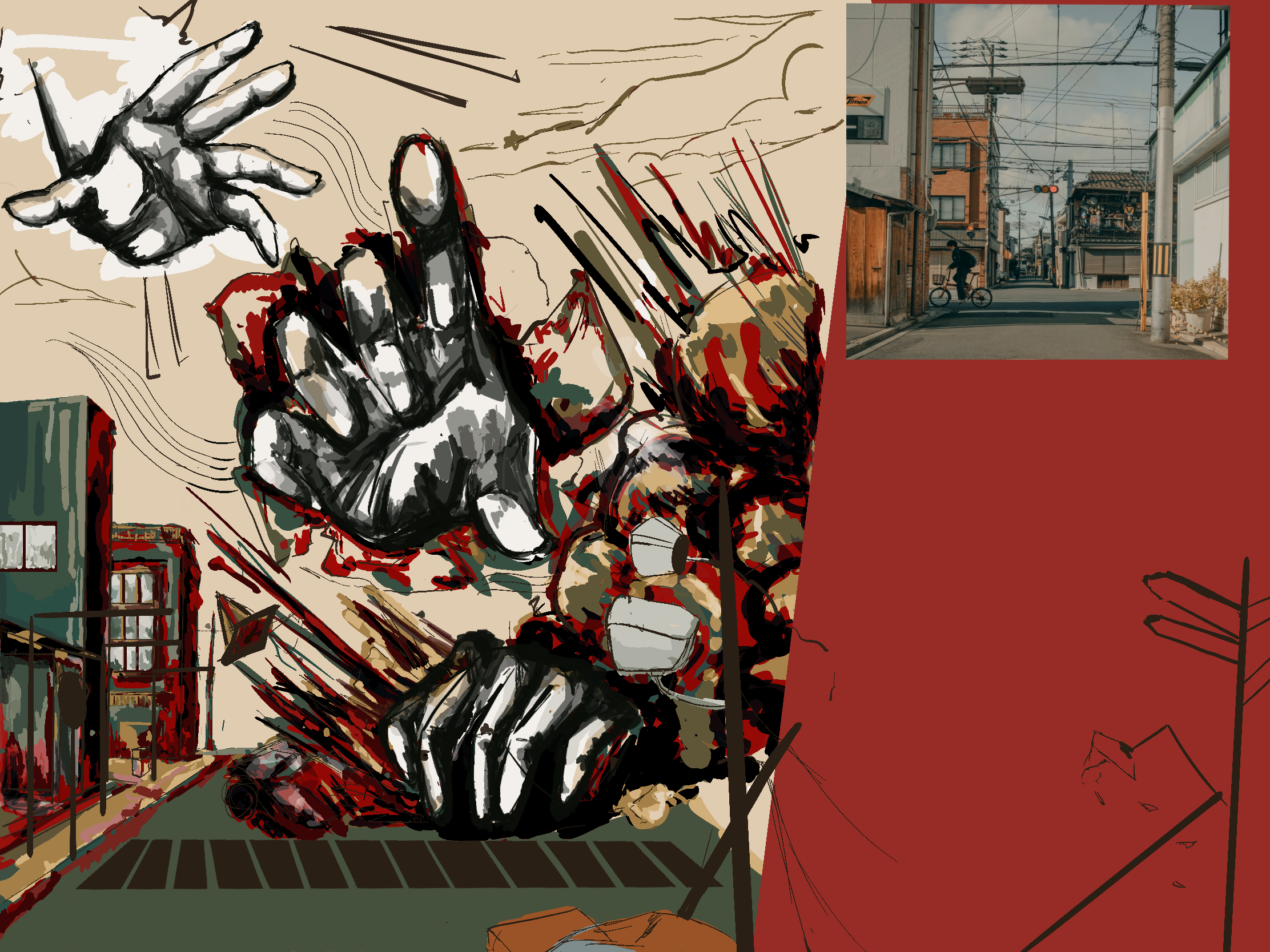
Contents draft 4 (final)
After violently abandoning the previous piece I moved on to the next one.
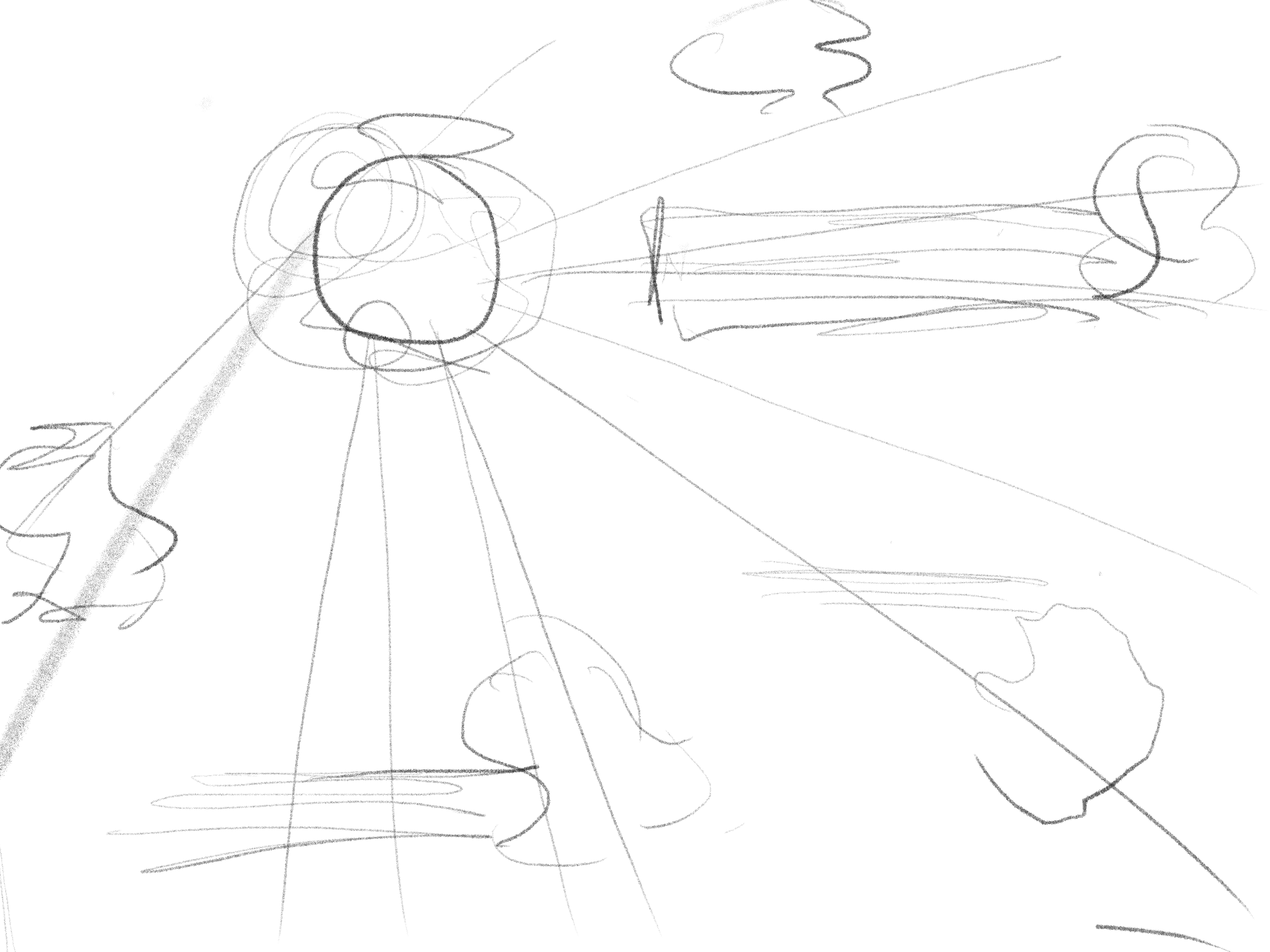
It is of note that I had already finished the cover draft at this time and was fueled with motivation rather than spite for this project. After finishing the cover draft which took forever, I had developed a consistent workflow. I was more confident with this piece and therefore a lot more experimental using various techniques I had never tried before. Surprisingly, when it took my previous piece 2 months, this piece took 2 weeks, it was swiftly made mostly because of the influence my previous piece had on me as well as the approaching deadline.
I skimmed over my previous attempts at the other contents pages. I noticed a messy-like, experimental pattern among them. I realized that perhaps that's what I wanted in my piece. It was the product of all my experiences combined. I hadn't even colored in any of my previous pages either. With this in mind, I created a piece I hadn't expected. The colors were a completely new ball game for me, the previously rendered cover was cleanly made, this time I wanted a more abstract piece, directed to the different tastes of my audience.
Here's a little insight on my workflow:
- Initial draft
- I draft all my pieces at once in a category, in this case I drew all my drafts for the contents page at once, with the exception of the third draft, before expanding on each of them one at a time
- Hand practice
- I practice all the parts I am weak at prior to the piece, weeding out bad sketches in the process.
- I shade in to see where lighting would hit the hand and overlay the elements that look good on top of the draft.
- Base colors + Rendering
- I sort out base colors and shade. This time I skipped over the rendering and used black and white colors only.
- EXPERIMENTAL! : I used a gradient map instead of rendering directly. A gradient map replaces all the values on the black and white scale with the corresponding colors, this speeds up the process and allows me to focus on touching up rather than hassling with color theory.
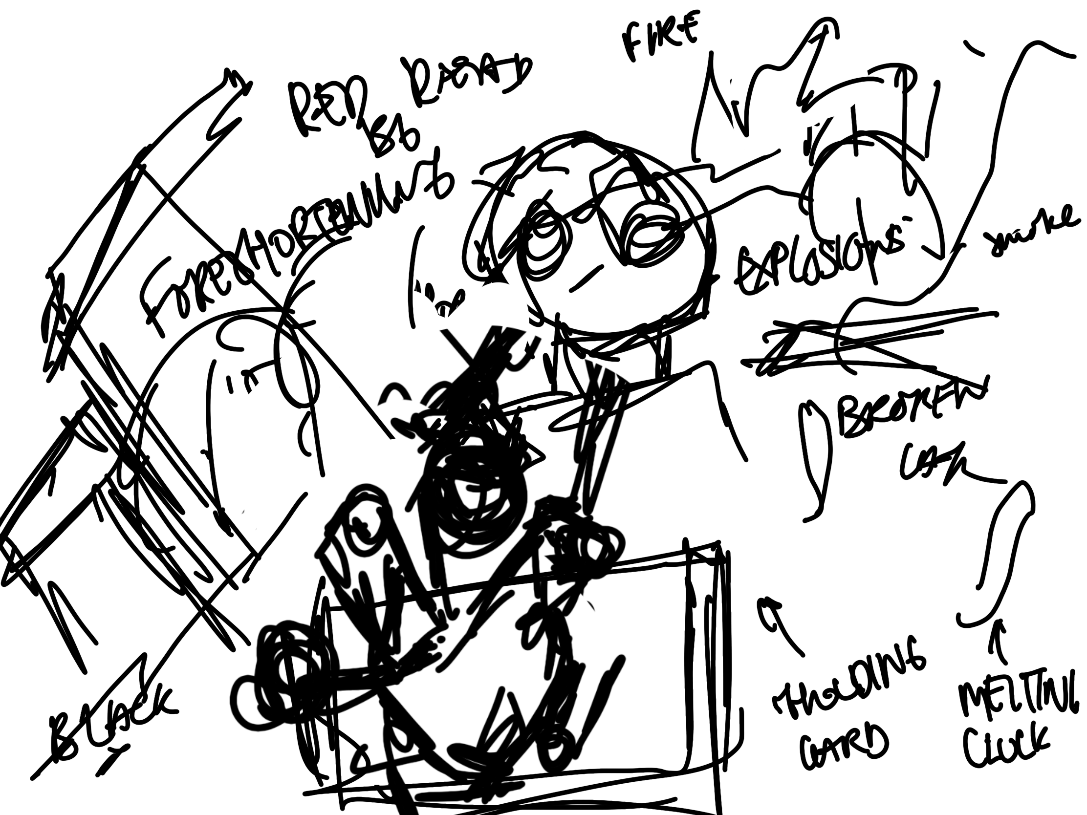
- Since I had opted for a chaotic piece I incorporated different color styles and different styles of shading to make this piece look incredibly loud, I wanted this piece to catch the attention of the viewer. As if it were physically reaching out to the viewer.
- Editing + Experimenting with blend modes
- From the very beginning I wanted the hand to seem like it was coming out of the page, and designed it as such. I edited a picture that I took of a crumpled paper, it fit perfectly in the piece, I thought it was worth exploring more and continued to render it more so that it would fit the style of the full piece.
- EXPERIMENTAL! : I played with different blend modes and it completely changed the piece, using color burn, color dodge and linear light. The colors popped a lot more than it had before. The page went from dull to bright with the help of a few strokes. This was my first time using color dodge, it brightened the piece to another level.
After a bit more rendering, the colors felt complete and it was time to place some text on it. I separated the the contents by category, 4 categories being available, then added page numbers later. Overall, I am very happy with this piece, the colors and the styles are very much what I had imagined in the piece.
.png)
.png)

-Recovered%20copy.jpg)
ANALYSIS AND EXPLANATION:
This piece holds a lot of meaning, it is not just full of mindless colors, within the piece there is a story being told and a strategic placement of colors.
I followed the 60:30:10 ratio for the colors, red, green and yellow accordingly, as well as black and white for secondary emphasis. The color scheme chosen follow the RGB primary colors, red and green being complementary main colors, yellow as an accent color. These colors are used to maintain balance and engagement with the viewer.
One meaning of the piece is total destruction and chaos, this contrasts the clean linework and colors on the cover and subverts expectations. This fits the theme of "neue" and art. This is what I wanted to show. How art can literally be messy and destructive, another side to art as expressed in the art of the contents page. The second meaning is beauty, the street's zebra lines double as piano keys, yet another form of art, hence the musical notes. I thought this was a good representation as a way to display "beauty in destruction" as an element in the art piece (beauty) that shows a mess of colors and destruction while being a good contrast to the noise, ironically. On the other hand, the notes by itself could be interpreted as an onomatopoeia for the destruction, alongside "boom" as one may infer that the explosion is musical.
I chose hands to be the main subject of the piece as it was perfect to portray art, art is mainly made by using your hands and so I wanted it to be shown in this piece. Secondly, I wanted the hand to engage the viewer, as if it was physically reaching out through the page to touch the viewer hence the crumpled paper behind it. The foreshortening of the hand aids to this notion. Earlier, in the cover page, I wanted the viewer to remember the magazine, to keep them staring at the magazine longer than they should, whereas on the contents page the goal differs, the contents page is meant to indulge and reach out to the viewers, as if it wants to reach and tell them to stay to read the rest of the magazine. To combat the chaos, I used the contents on the side as a tool, though I made it bright to fit the theme, I organized it in a way that was structured and neat. This contrast allows for balance. The contents side is cleaner and easier to rest eyes on, this is intentional to give the viewers a break from the chaos on the left side and forces their eyes to read the contents; saving the other half for later.
Overall, I went for a more comic-like style, chosen after my first spread and attempt at the manga/comic style. The paper, effects, signals all add up to give off that style. I like how it turned out despite my lack of drawing skill.
Below is a time lapse showing this process, it is recommended to watch at highest quality with 2x speed. The video is silent so viewers can listen to their preferred music. Enjoy!