2PS draft 1
For this draft I wanted to embrace a more manga-esque style. I had to decide on a certain composition and eventually settled on a glass-type effect with various panels splayed across their reflections. I had a very hard time trying to make an arrangement for the manga panels and how the speech bubble would look. Though I wanted this style, the effect is not fully seen until the entire rendering process completes. Overall, the results are still very far from the concept I had envisioned, in order to make this the final I would have to pour a lot of time into the process. Since I wasn't too sure if this was the style I wanted to commit to, I wasn't very willing to further expand and render it. I never did complete it. However, at the very least I got the basic idea down.
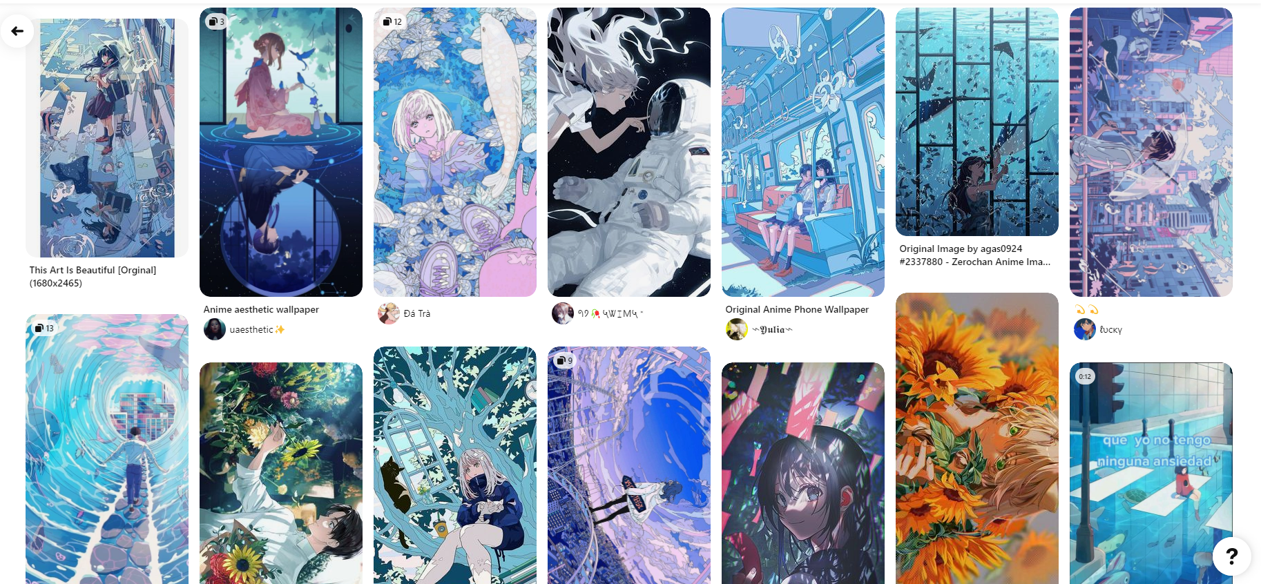
In terms of the steps it took, I first had to choose images that seemed manhua/manga-like, searching them on unsplash.com and pixabay.com which are websites that provide free, high-res photos. I searched up photos under the keywords “Shanghai Street” or “Shanghai cityscape” just to name a few. In hindsight, I probably should have chosen Tokyo streets to match with the manga theme, but at that moment my intuition decided to draw inspiration from the busy Chinese streets.
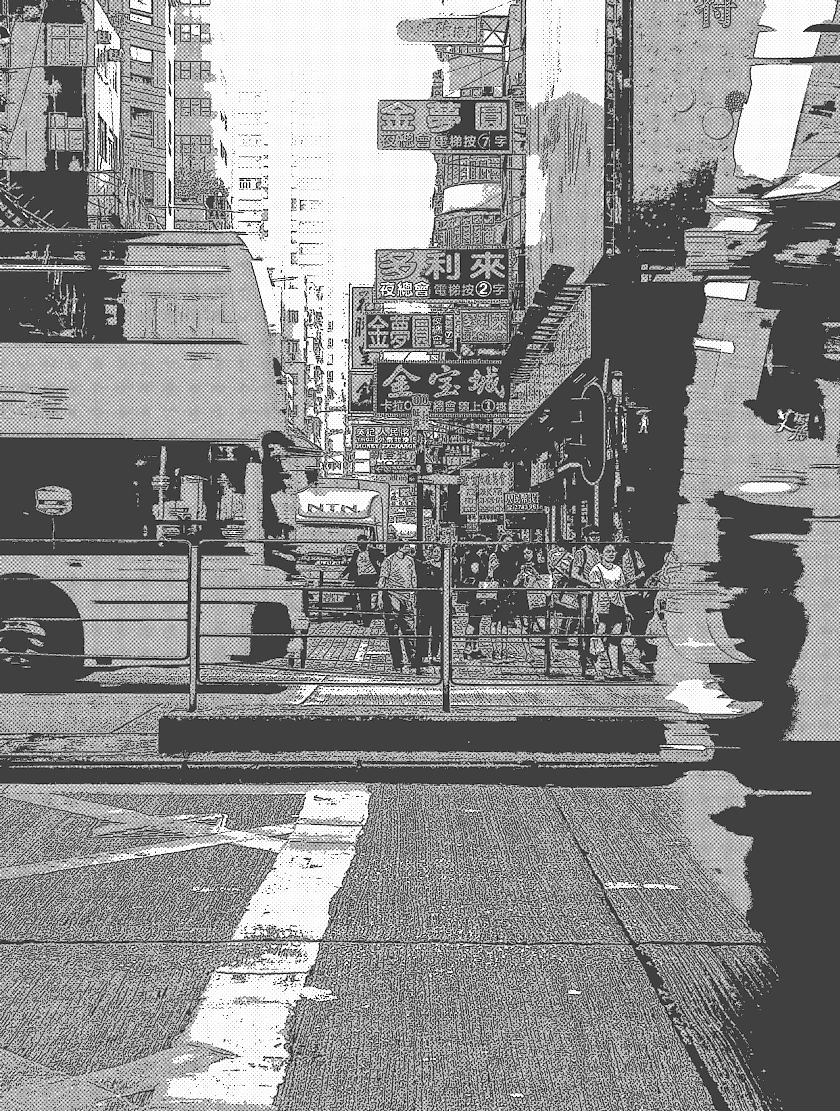
After which, I put the images on photoshop, used the color settings to desaturate the image so that it would be black and white, with this I added filters to make it look more manga like. Under the filters tab I used filter gallery and used Artistic -> Poster Edges and repeated the process with another filter Sketches -> Halftone Pattern I did this again and again until I got the results I wanted. Here's an example of the process.
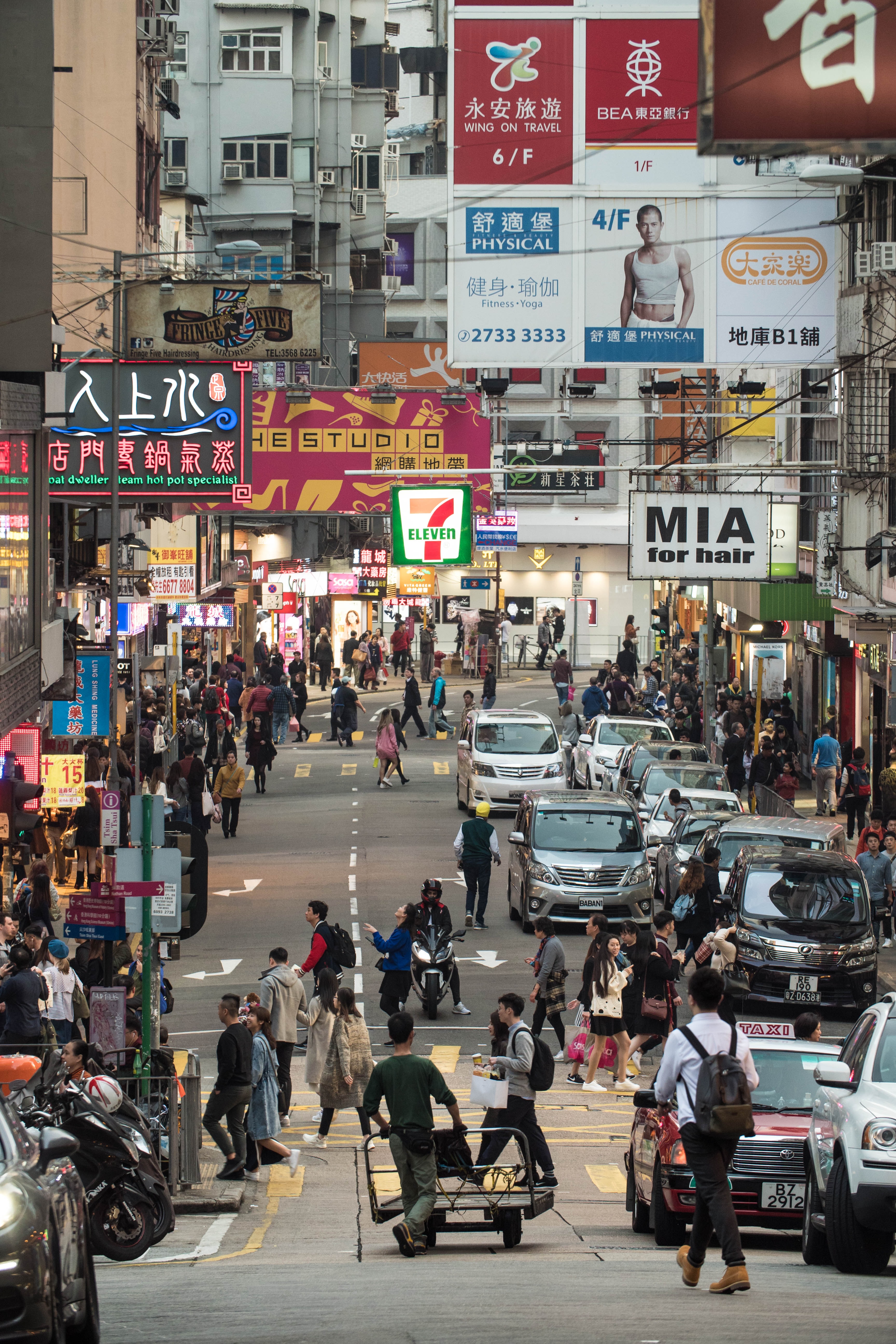
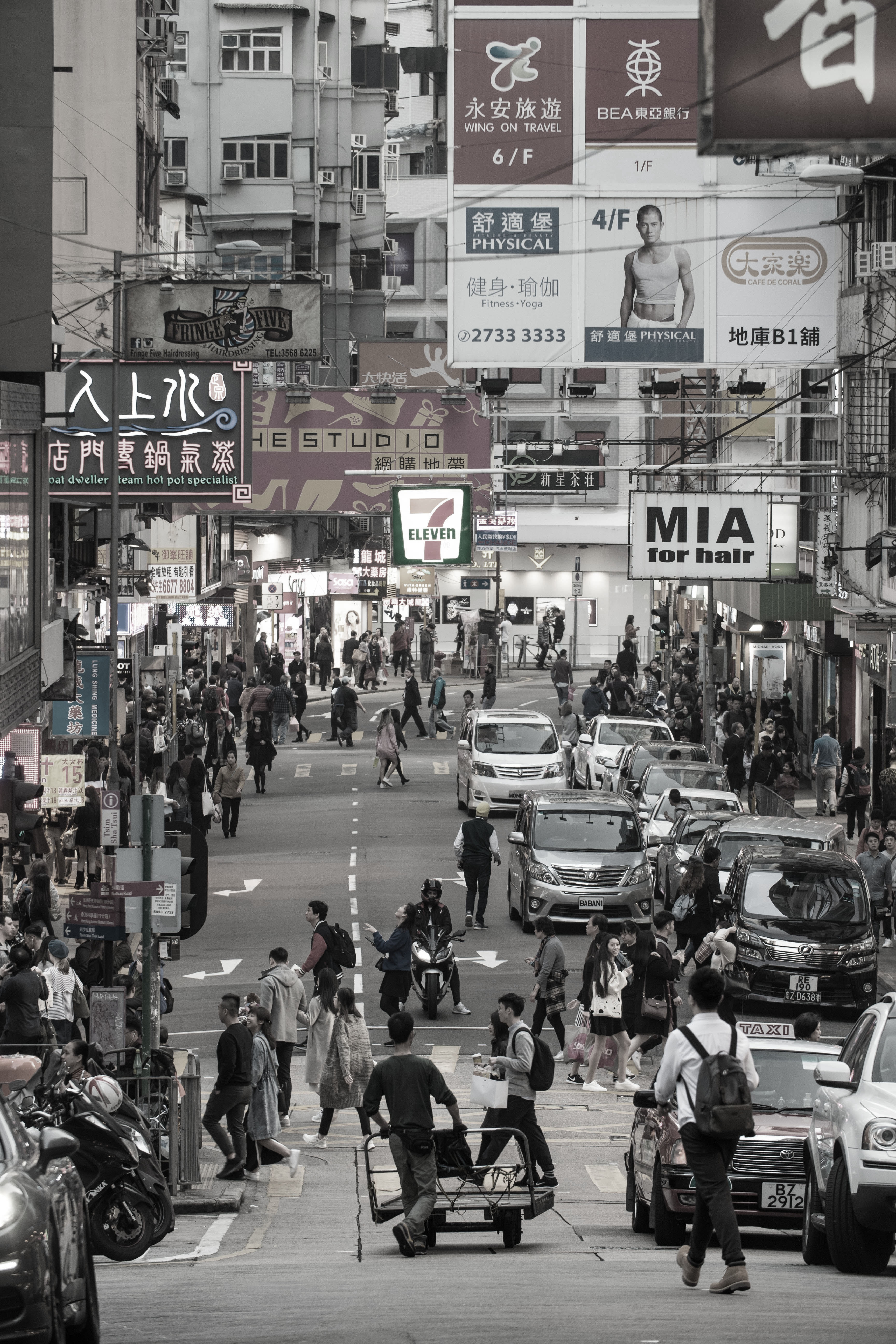
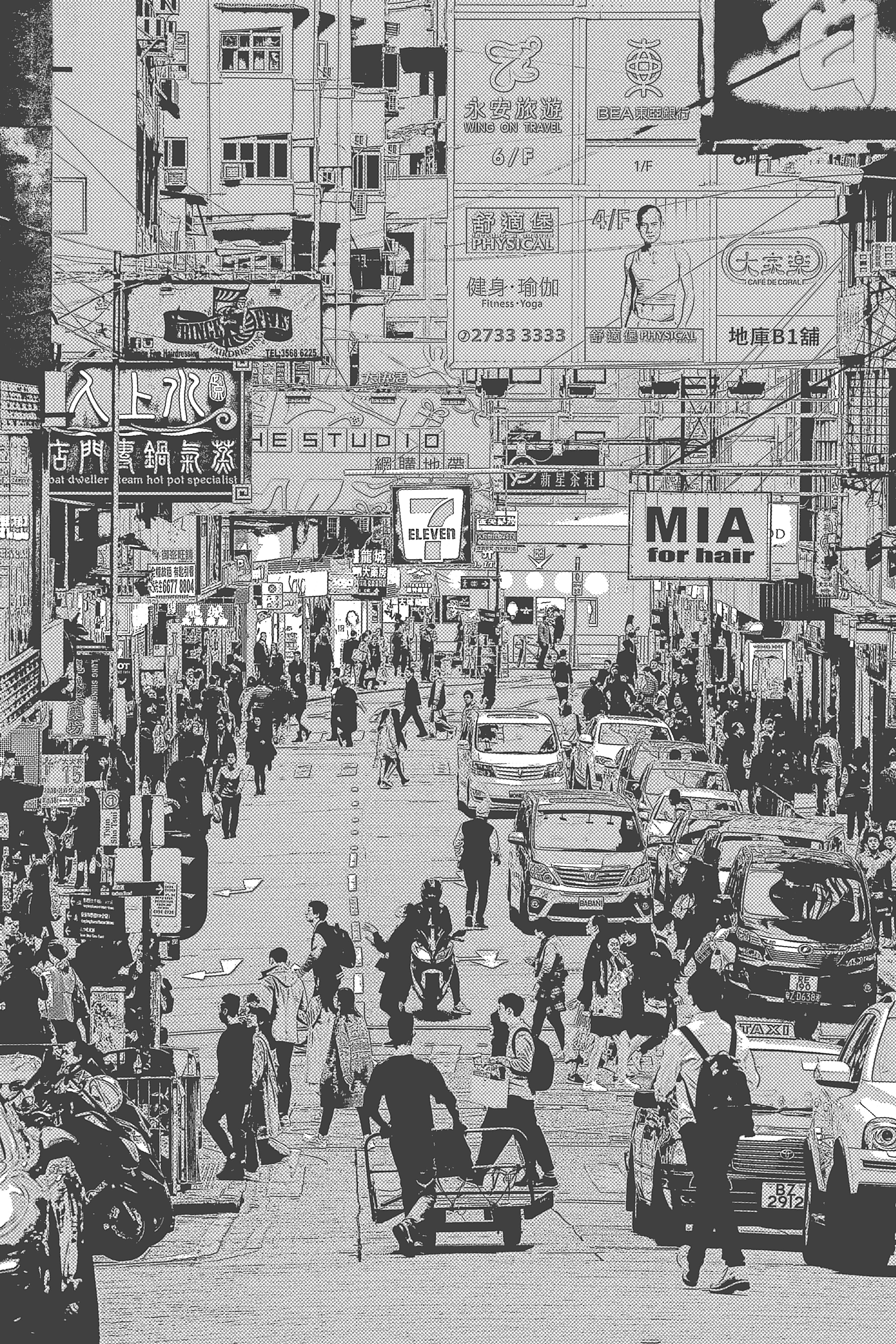
Here are all the before and after images I used. I had edited around 8 and collected 12 possible photos, these 4 are the last images to make the cut.


Then, came the next step, since this was only a draft and all these images were free I decided to put them into the sketch to get an idea of what it would look like after applying everything onto the template I created. After a few tweaks, it was finished.
As I was refining and finishing this process I realized that it was too far from my original idea and I'm not proud of this piece at all. It's a rough, quick draft that is far from finished, but that's not all too bad considering this exercise was used for setting down the groundwork and basic idea of what the magazine would look like in the certain style. If I choose to refine this page to use for my final it will take much more time and look completely different, a polished and realistic version of what the final would be. In this case, please regard this draft as unfinished, there are still many steps that would be involved in its continuation.


2PS draft 2
My second spread is the successor of the first contents page I had done, it contained muted colors and different geometric shapes. It was equally as corporate and cute as the contents page that matches with it. I planned for many overlapping images and graphic shapes for the piece rather than a conventional realistic style with proper images. This was a good exercise in building my confidence for alignments and composition formatting, using squares allowed me to ponder where they should be situated for an interesting composition. The circle helped balance out the blocky-ness of the piece.
The colors I used were intentionally muted to contrast the bright contents page, whilst still matching the cutesy style. I felt as though this brown-beige style was trendy and aesthetic enough to use.
However, I doubt I will use this piece as it seems too simplistic and boring, though the combination of this spread and the contents page were cute and showcased my versatility in different styles it wouldn’t make for an impressive page with how bland it is.
.png)
2PS draft 3
This spread is the roughest draft of them all, with me using an image I found online to best describe what I would envision the spread to look like, credits to Waneella, for creating this piece "Shadow" on Twitter. I also wanted to use pixel art and I liked the use of perspective in this art, this image is the closest thing to the idea that may eventually become reality. Of course, I am not going to use this image in the final as the art is NOT mine, however for the draft, as I was not sure whether this is the idea I would commit to, I thought it would be better to put an example instead.
I do not claim Wanellas work, the picture is only used to help visualize what the spread would look like if I commited to the style. It is NOT mine.


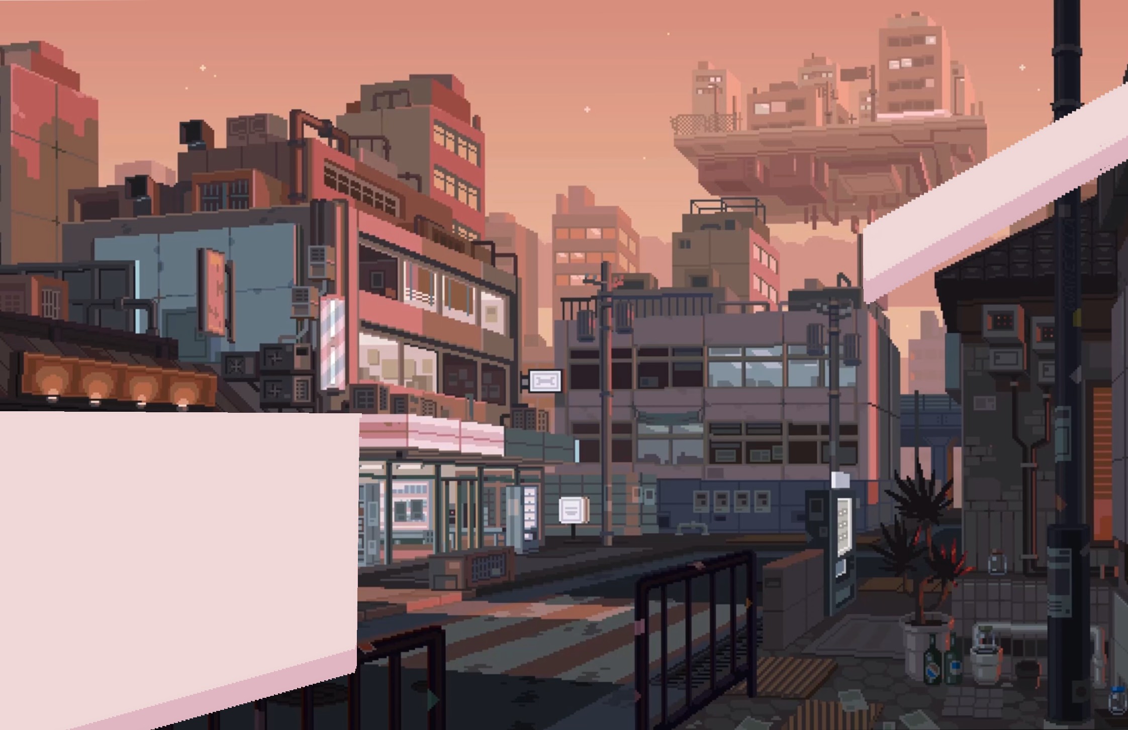
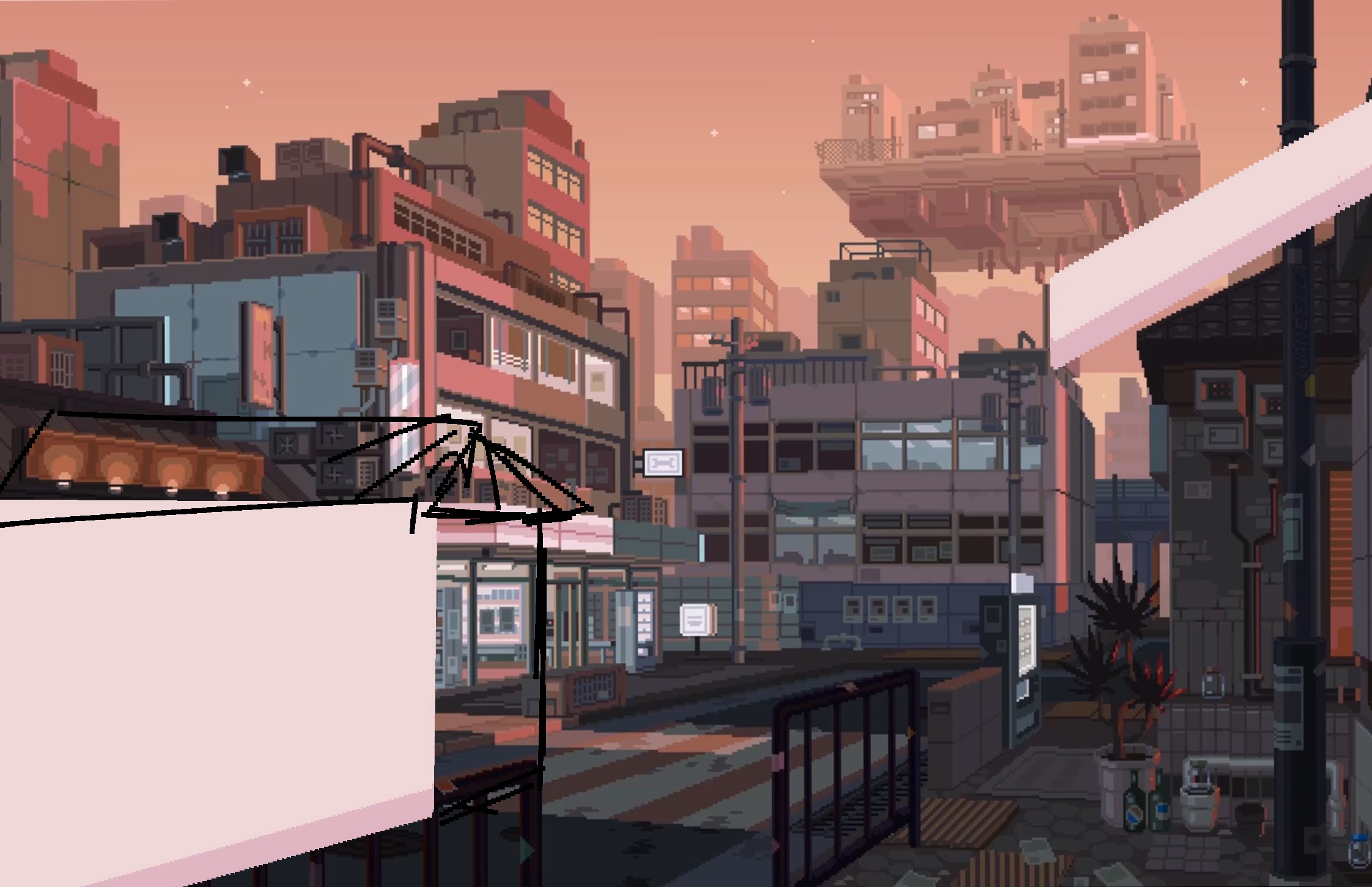
For my idea, I would also be using buildings but in a duller, blue orange color palette, with this perspective, under the inspiration of the pixel art spread I had analyzed, I would put one of the boxes of text in one of the building walls, all of which being in perspective.
Although this idea is the most dynamic and I feel like it can be done, I am not too sure of choosing this idea. The art would require a lot of work in filling all the little details and I am not even sure if I have enough confidence in my artistic capabilities to do something like that from scratch digitally. However, if I do settle with this idea I will have to pour in a lot of time and endure the frustration of it not being as good as I imagined during the early stages, which I know would be further demoralizing until I finish or give up. Depending on how much time I have available and my willingness to exceed I may choose this tough challenge.
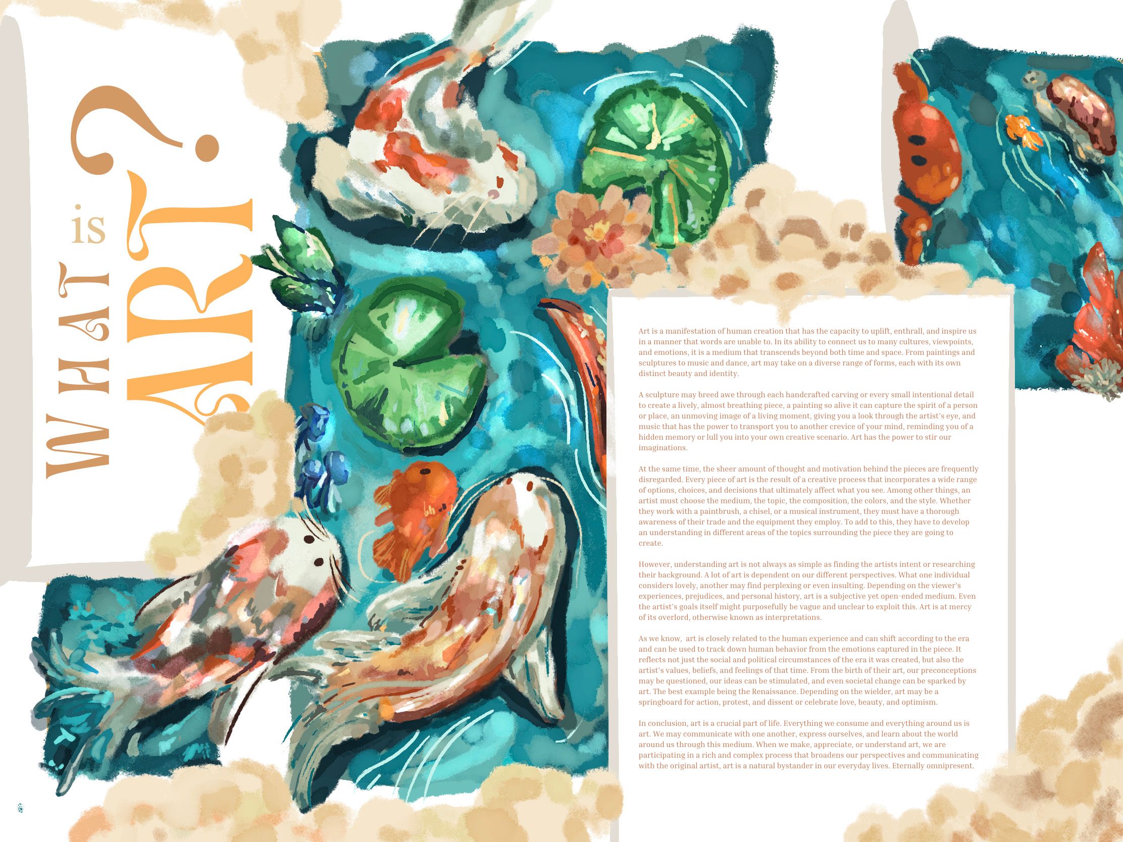
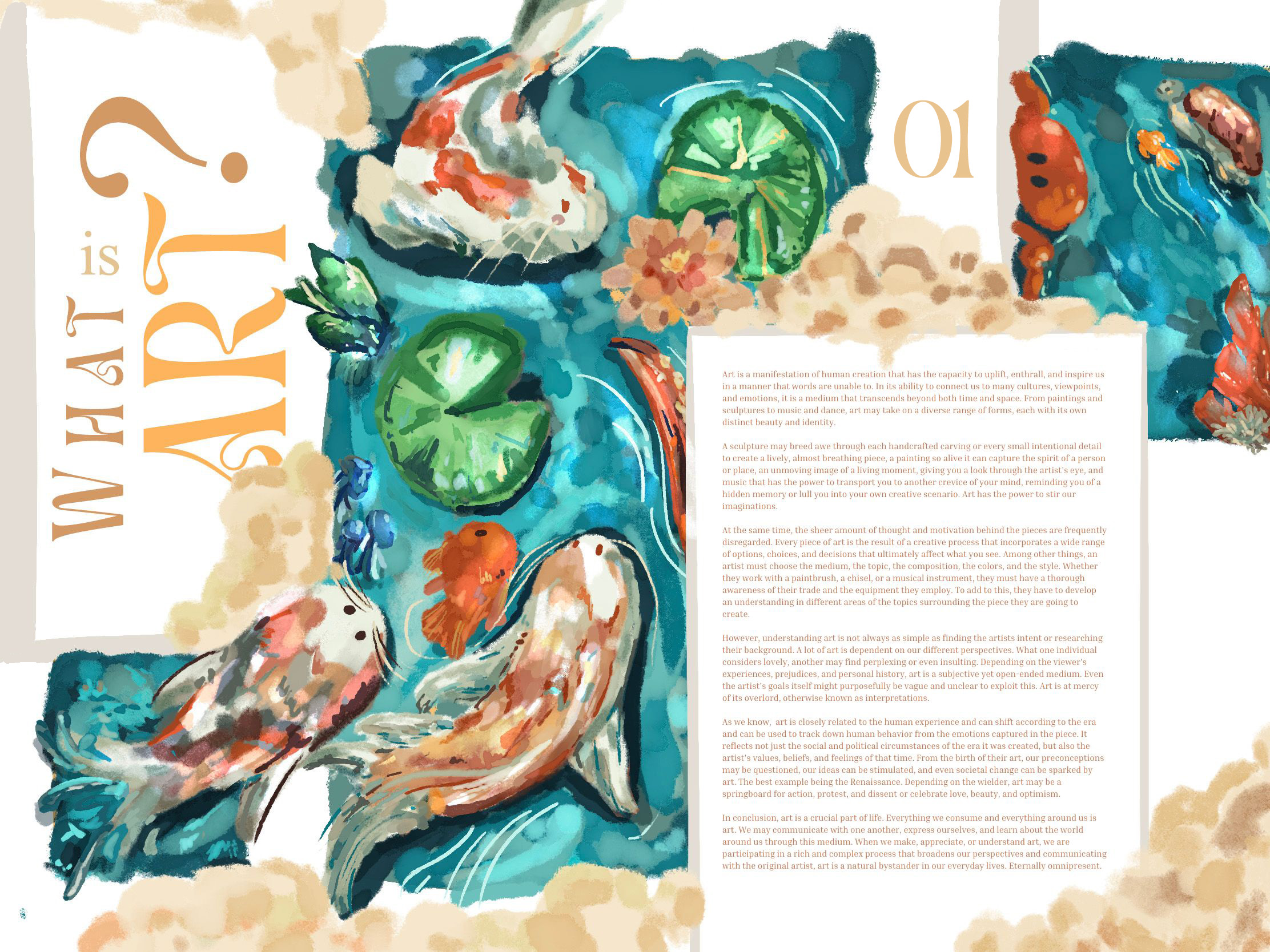
2PS draft 4 (final)
I began this piece shortly after finishing my contents page, almost thematically, though the cover took 2 months and the contents took 2 weeks, the spread took 2 days only when nearing the deadline. This was particularly refreshing, I realized that my speed was increasing, not because I'm getting sloppier, but because my skill level was increasing so that I could make quality work within 2 days rather than dragging it out for 2 months.
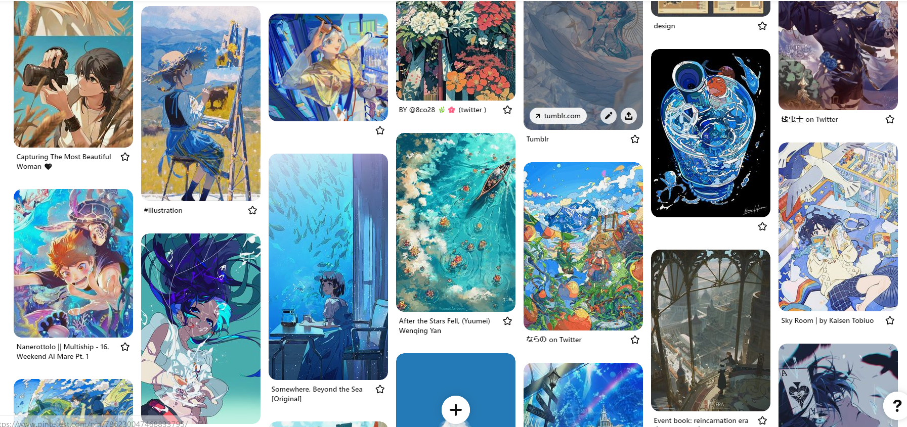
I began with figuring out the alignments and dimensions, earlier in my cover I was following the golden ratio and my contents page loosely followed the alignments I put in place before, this time I followed the alignments I had set up earlier on that copied a conventional magazine. Since I knew what to do, this was inexplicably easier, and the work flow was faster, I adopted a sketchy, softer paint-like drawing for the spread. Staying within the alignments I put in place, I started drawing up a draft with the following references.

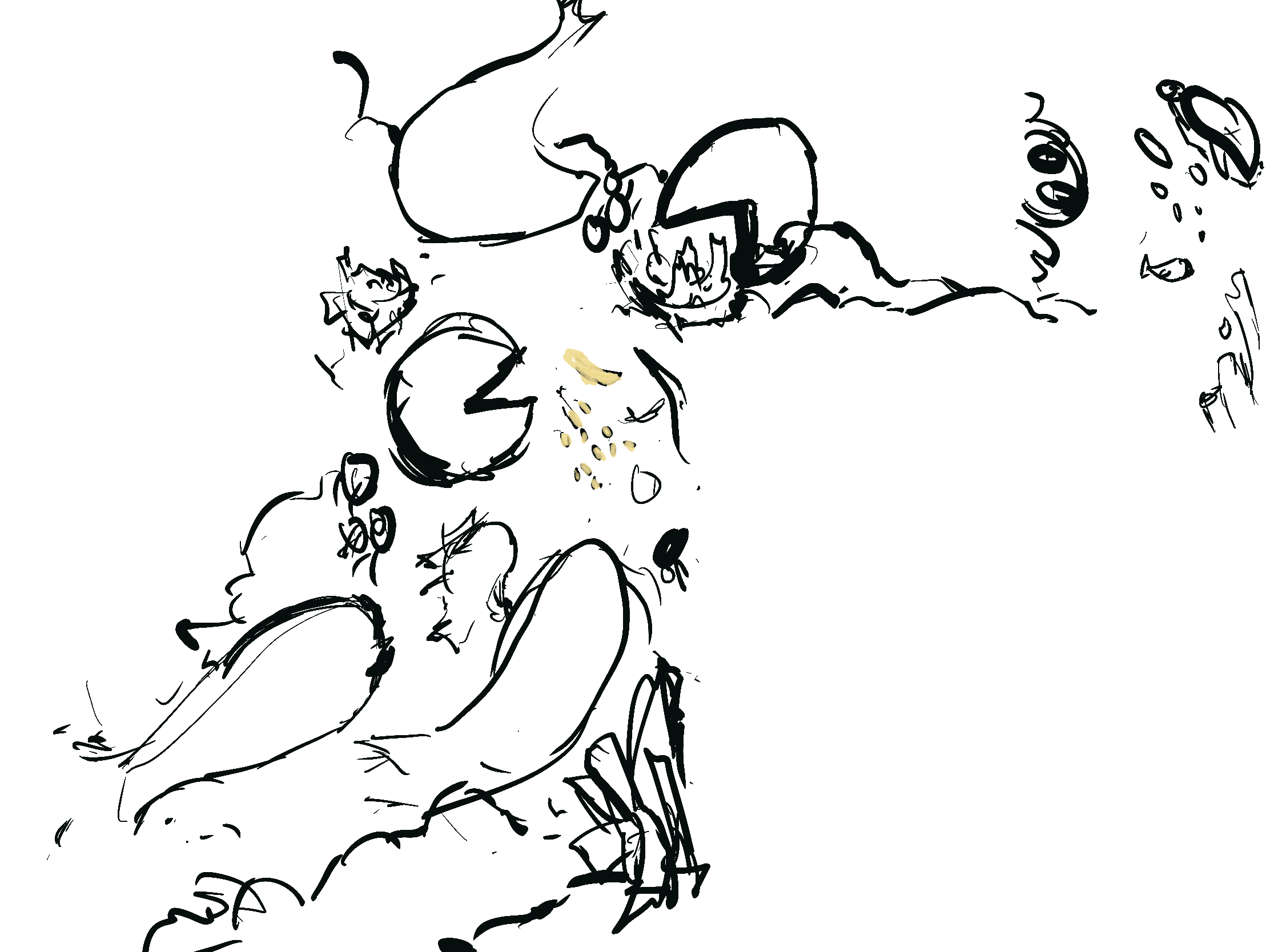
The draft helped me visualize the coming piece, it was really simple and easy to experiment with because the elements were so easy to manipulate compared to the different perspectives I employed in my first two pieces, following this I continued to render the drawing, it was a fast and simple process as the brush I was using did most of the texture work for me. The brush is a default brush "Mercury" on Procreate and helped to emulate the soft cutesy feel for the aesthetic audience. The colors had a certain shine to it after I used a different blending mode, called difference, I shaded certain parts to give it a subtle shiny gleam. This was really different to the modern cover and the chaotic contents. This was mainly aesthetic conventional art to follow through with the audience's expectations.
.png)
Finally, I added all the text and the category adjacent to it. I chose colors that fit the theme. I think I struggled a little with the placement of the category, so I made 3 different versions, the first being without the category, the second with the category number in the box the other words are, and the final with the category on the top right. I like all of them, it was really hard to choose between the second and third placements of the category, ultimately I like the third one most because it fills in the space on the top, above the article and is more viewable to the reader. I also think that the "01" looks a bit random on the second version and breaks the fluidity of the sentence "What is art?" and would be harder for the user to read.

ANALYSIS AND EXPLANATION:
This piece doesn't have a particular meaning, it's simply art. I demonstrated how profound art can be and the meaning previously, this time I catered to a simpler meaning, art is art. Additionally, I made it simpler and seem quieter so that it wouldn't steal as much attention from the article, it's just used as eye candy for the viewers, pleasing so that it is easier to read and stay on the page, compared to the contents page which urges you to move on because of how loud it is.
Below is a time lapse showing this process, it is recommended to watch at highest quality with 2x speed. The video is silent so viewers can listen to their preferred music. Enjoy!