Here is my final cover and a few drafts that have been abandoned some time in the production process. My thought process was as follows, creating multiple covers, fully rendering them and choosing the best one afterwards. Thinking about the endless possibilities was addicting, there were lessons spent daydreaming about the different realms of art that I could force onto a page. Unfortunately, there was one obstacle shackling my ability to mindlessly create all of my visions: time. If it weren’t for the limited time I had to create this piece, I would have made unlimited variations for each of my ideas, in the end this was impossible and narrowing down my options was a process that came too early.
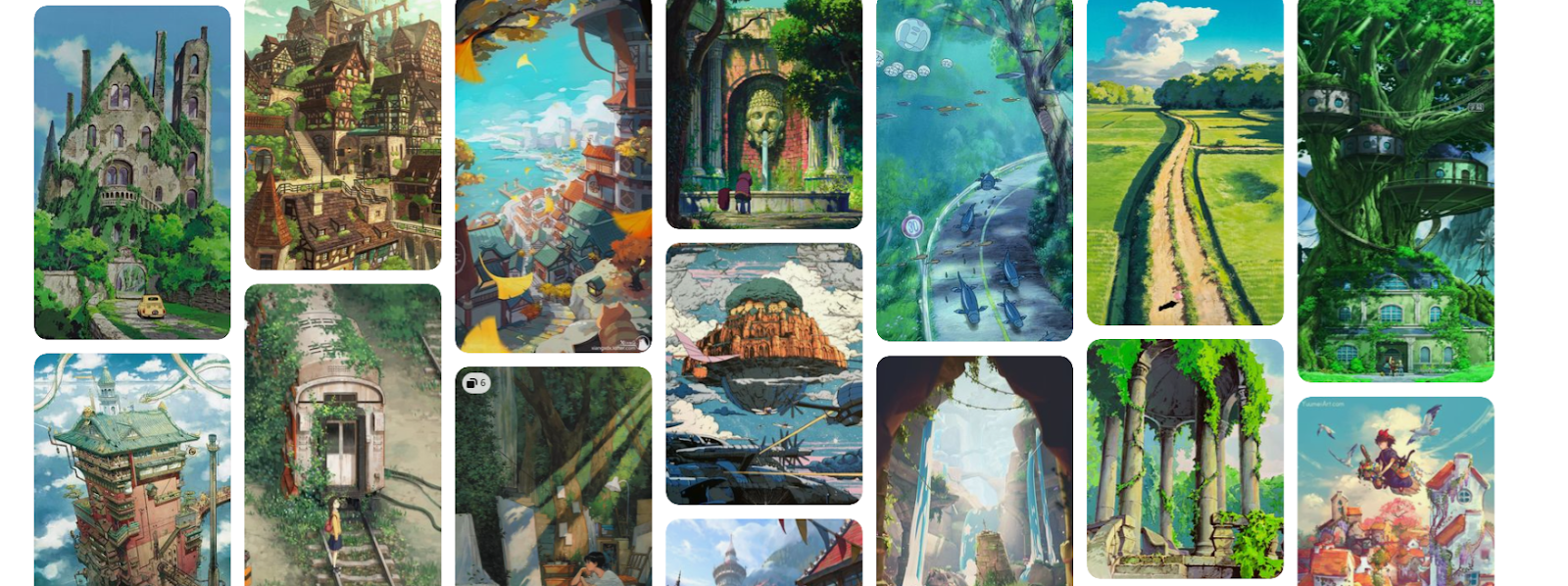
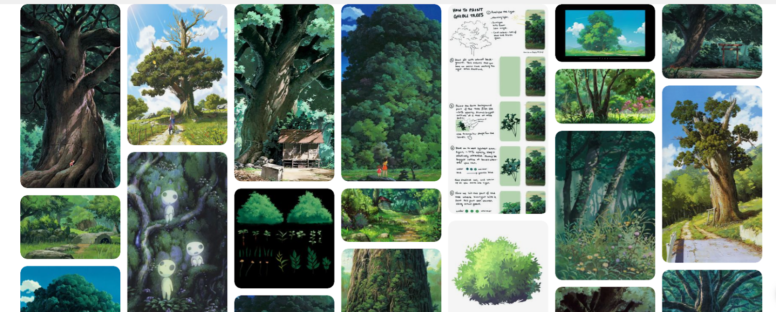
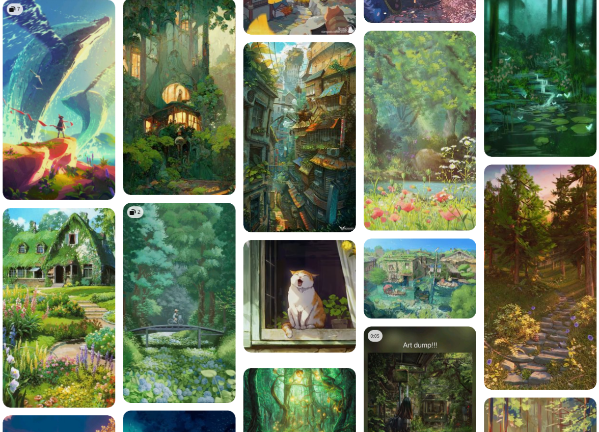
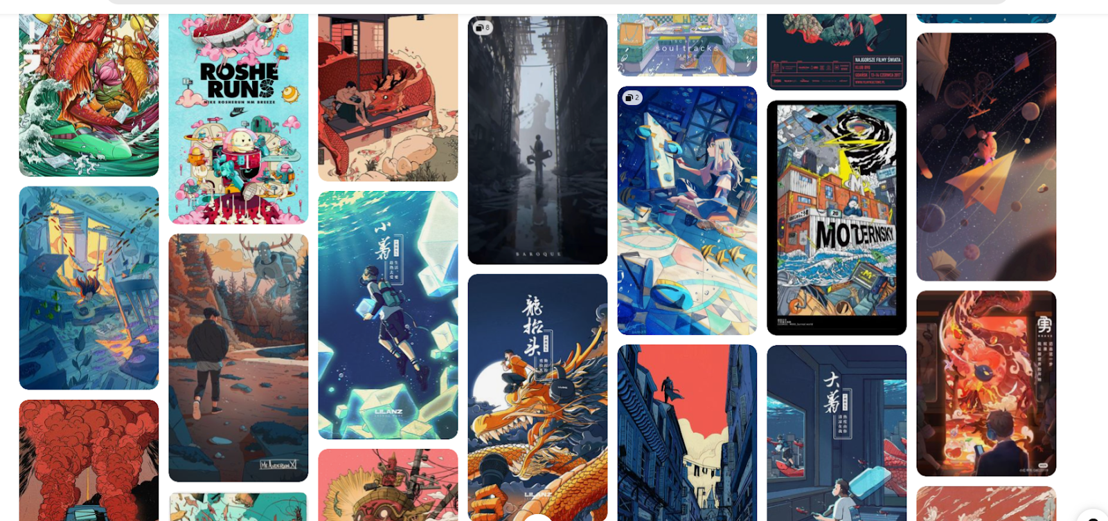
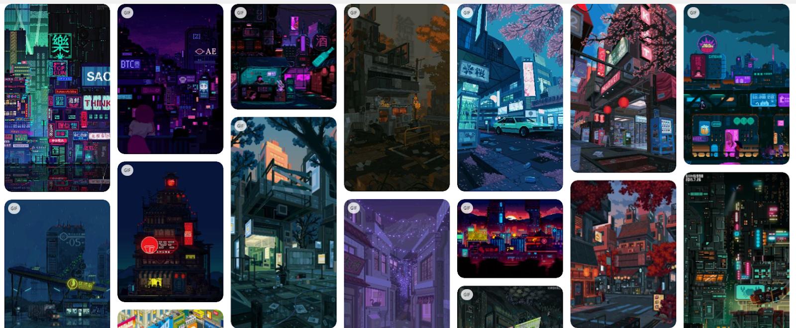
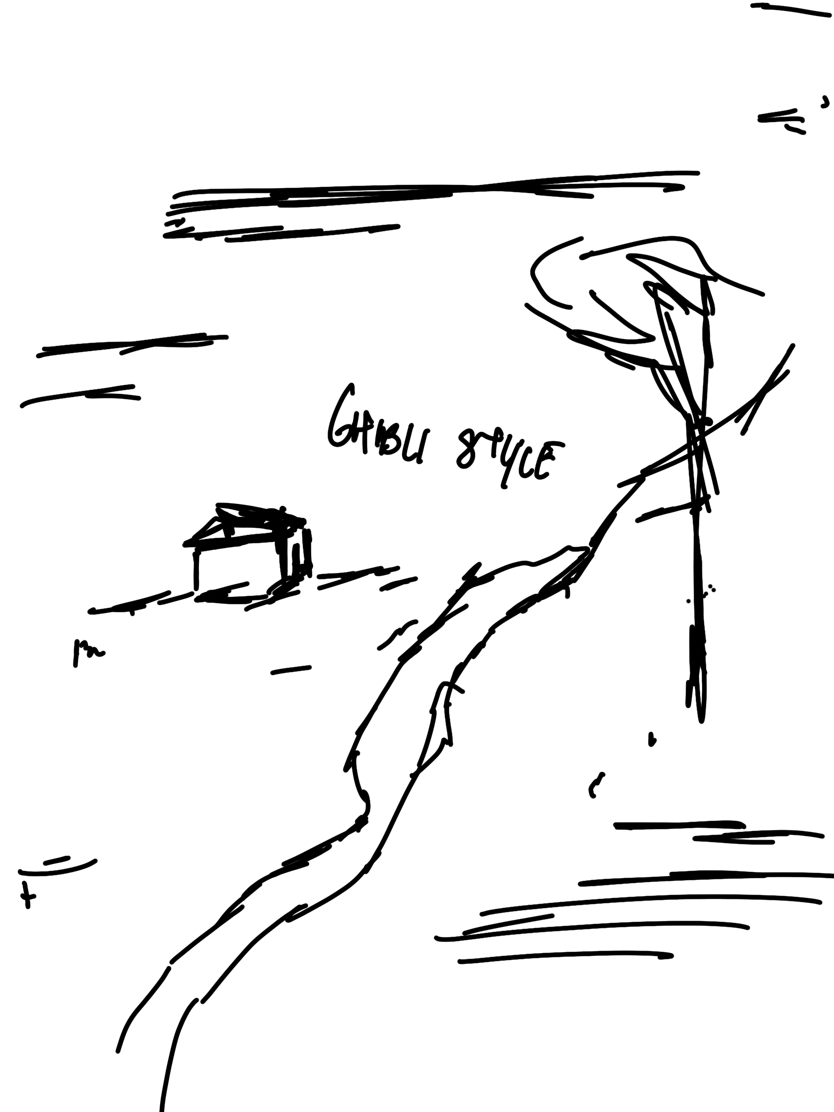
Initially I had mapped out ideas for 5 different styles. Ghibli, retro, pixel art and anime style with the following references.
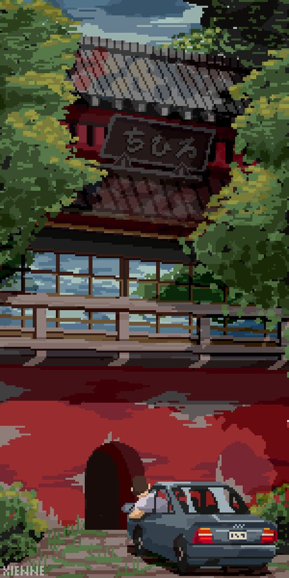
Ghibli style
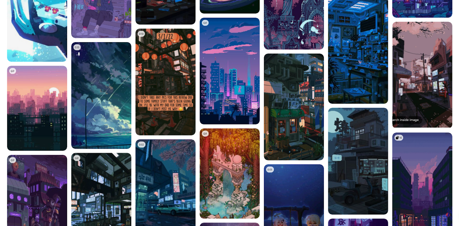
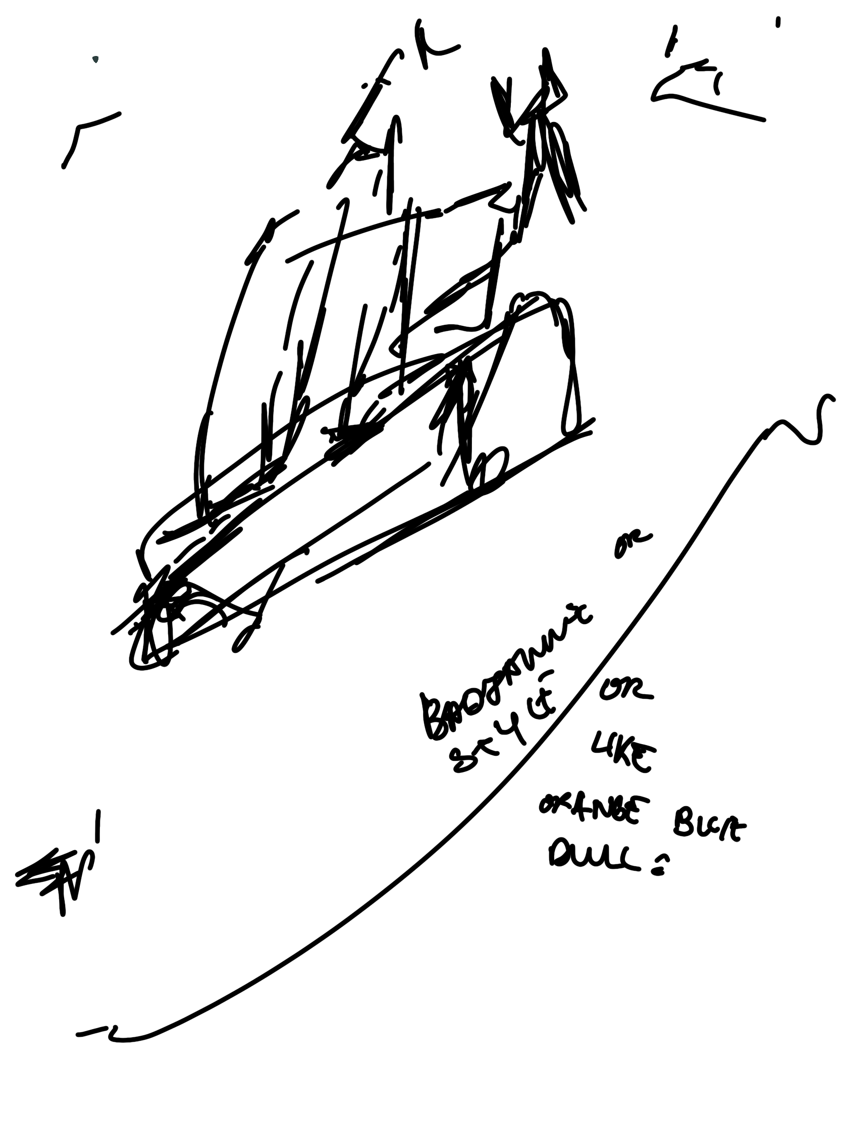
Retro style
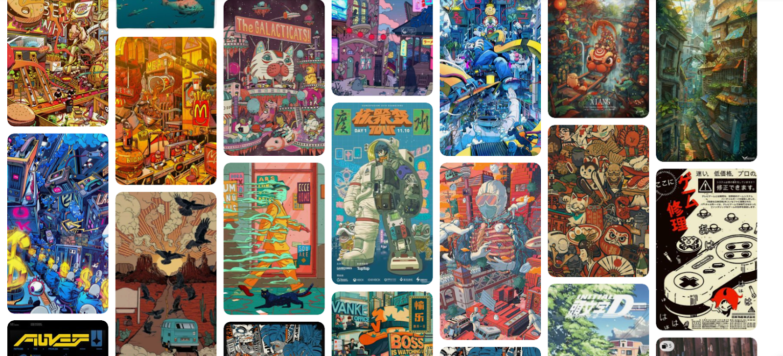
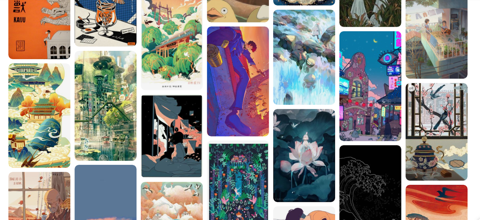
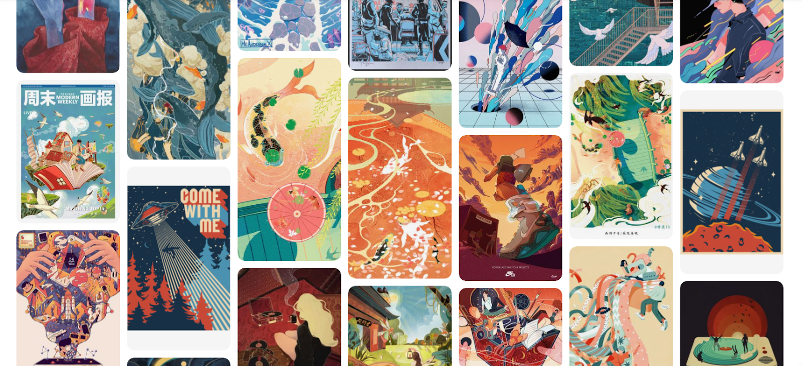
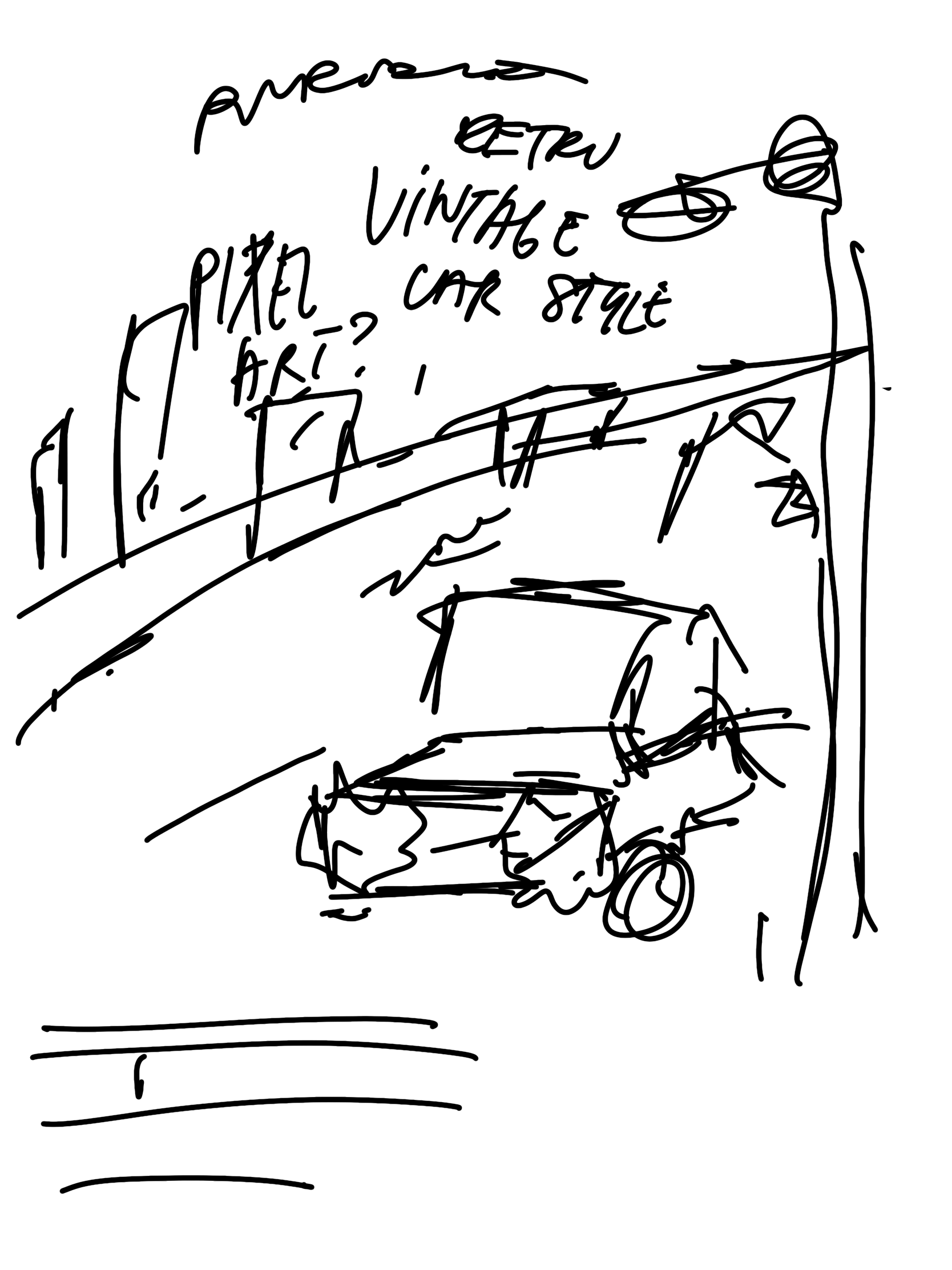
Pixel art style
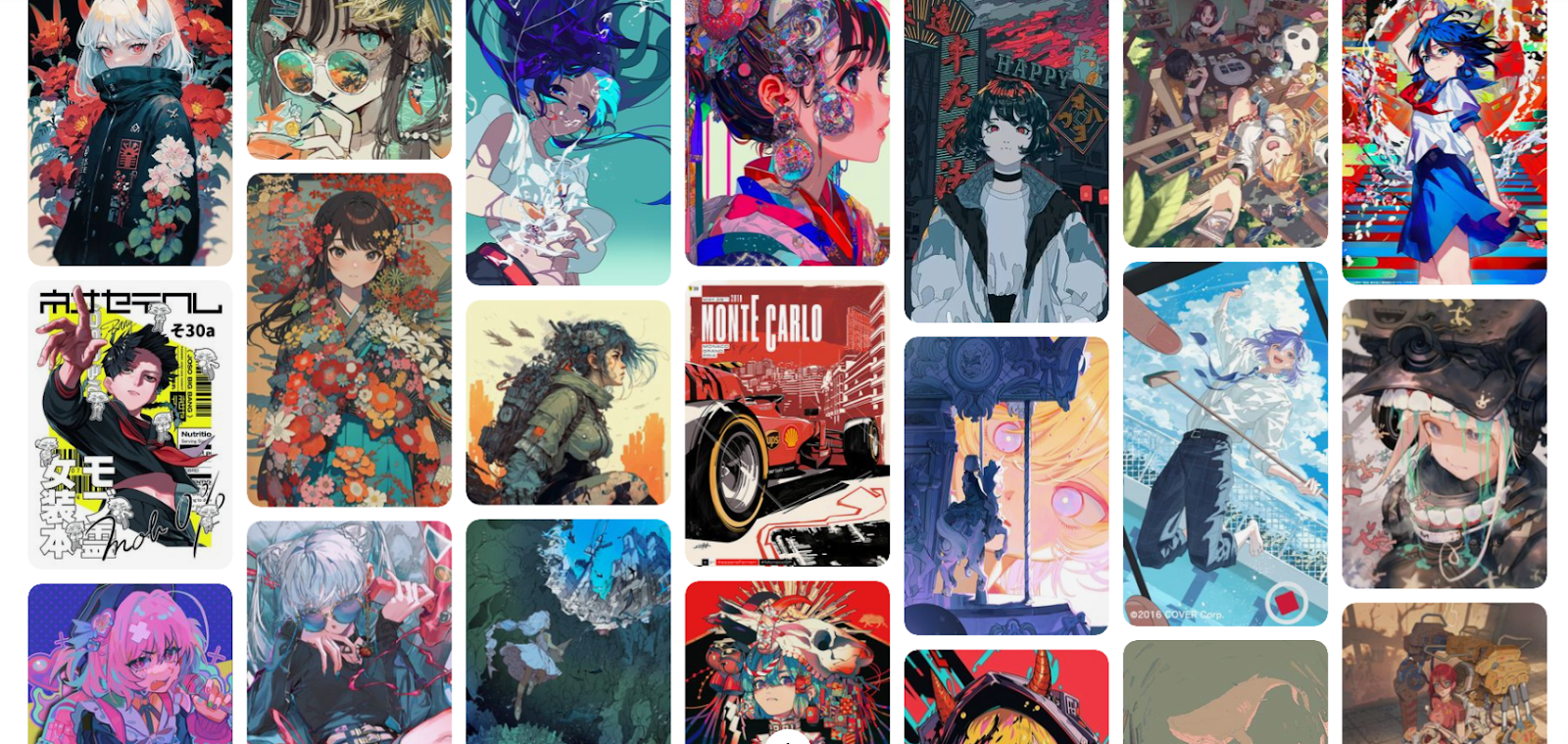
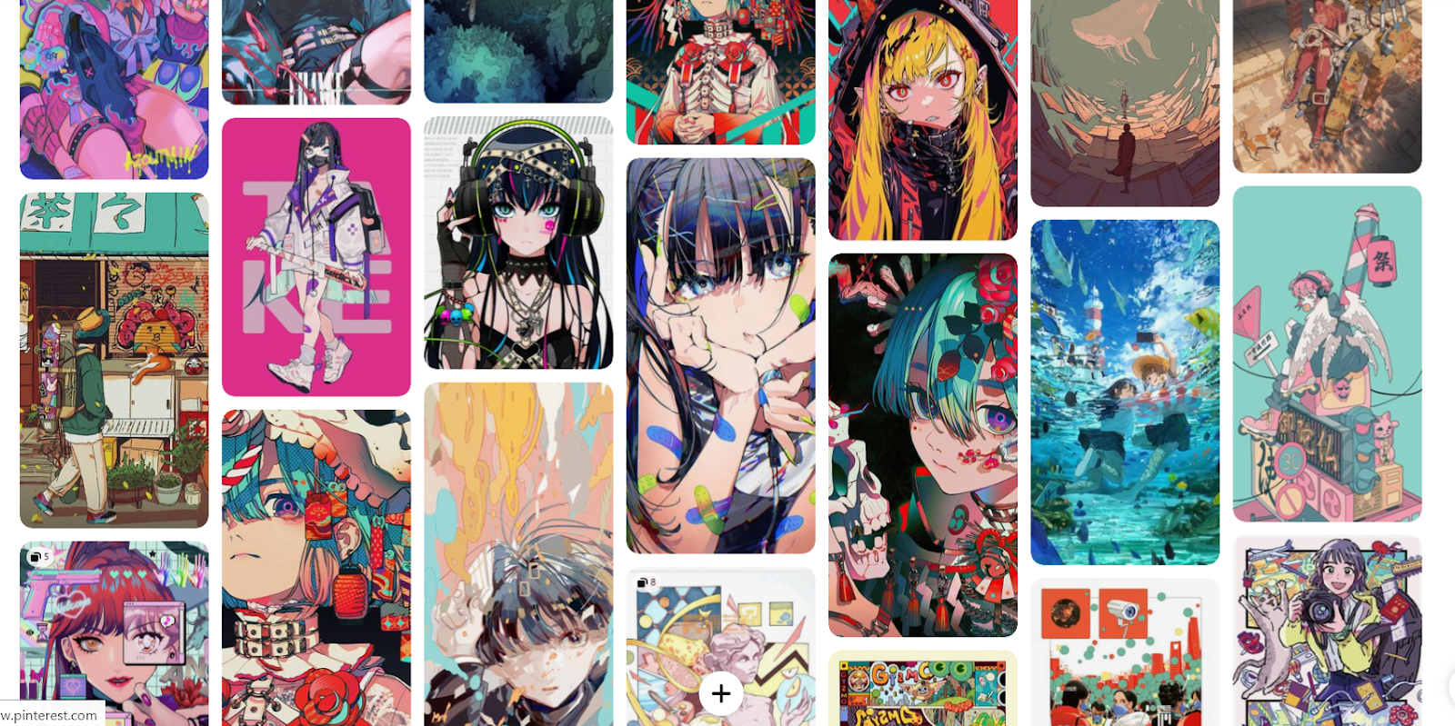
Anime style
These were the initial plans for each of these drafted ideas. I kept them short and simple to narrow down time wastage on little details, I wanted to keep everything fast and short. Easy and clean. The drafting process was fast and rushed.
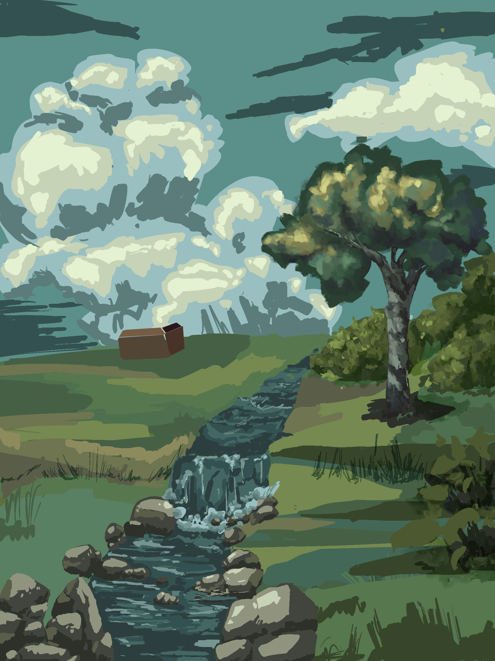
Ghibli draft
Retro draft
Pixel art Draft
Anime style draft
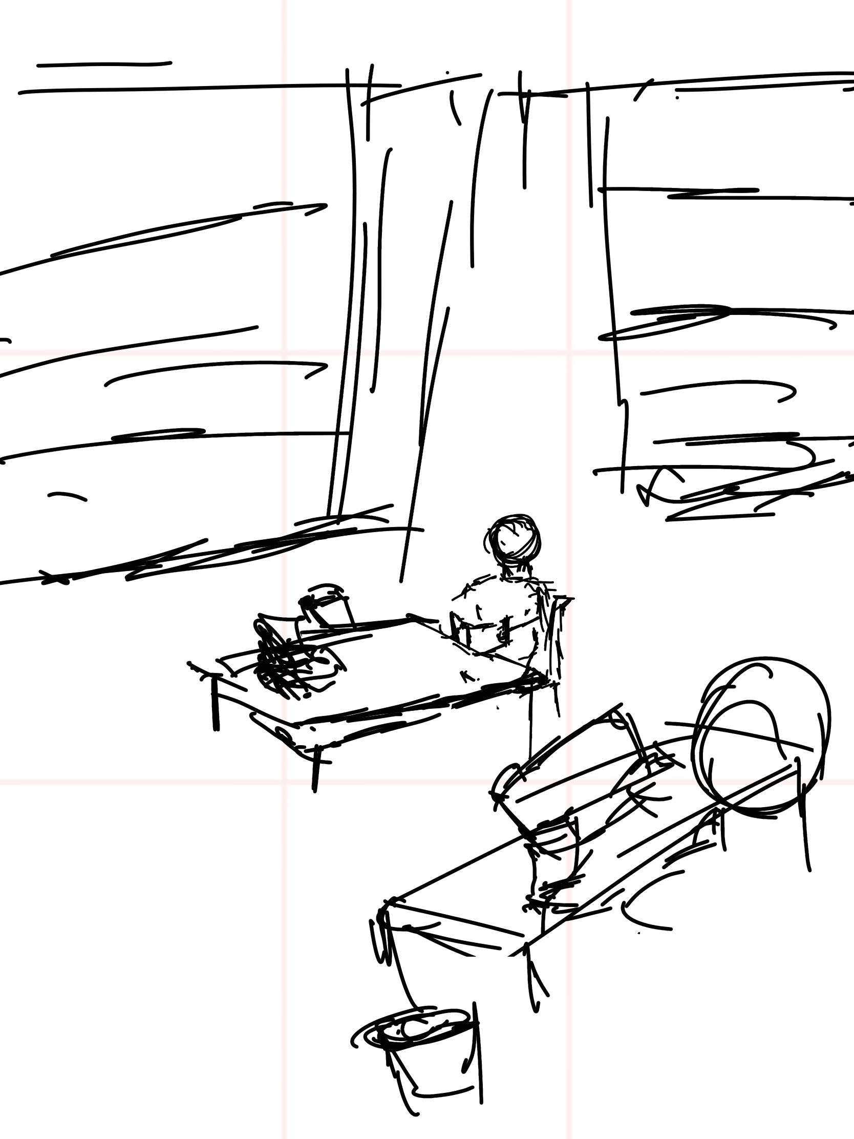
As I was solidifying my ideas, I realized how complex and how long it would take to see their final forms. Eventually, after spending an abundance of time not knowing what to do with the first cover, in the span of a few weeks, knowing I'd have to repeat this process 3 more times to choose the best one, I burnt out and gave up. My passion was only reignited when I came across tppo, an artist that enjoys to copy/mimic the style of pros and compiles all their techniques in a video. This was a big motivator for me as I could picture myself using these techniques and resonated with his level of art. If I actually dedicated time to learning art I knew I could easily get to that level. I quickly fleshed out a completely new sketch for this type of art, redirecting all my previous plans to this new piece and continued to refine it over the course of a month. There were many ups and downs in the process of making this piece, weeks where I would not feel driven to continue until I realized how close the deadline was and increased my pace. The final product only amounted to 48 hours of work, it was only due to my procrastination that the process was elongated to a month.
.png)
The process:
- A simple sketch
- Base colors
- Different background variations and combinations
- Finally, the full rendering of each element under the lighting of the same environment
Below is a time lapse showing this process, it is recommended to watch at highest quality with 2x speed. The video is silent so viewers can listen to their preferred music. Enjoy!
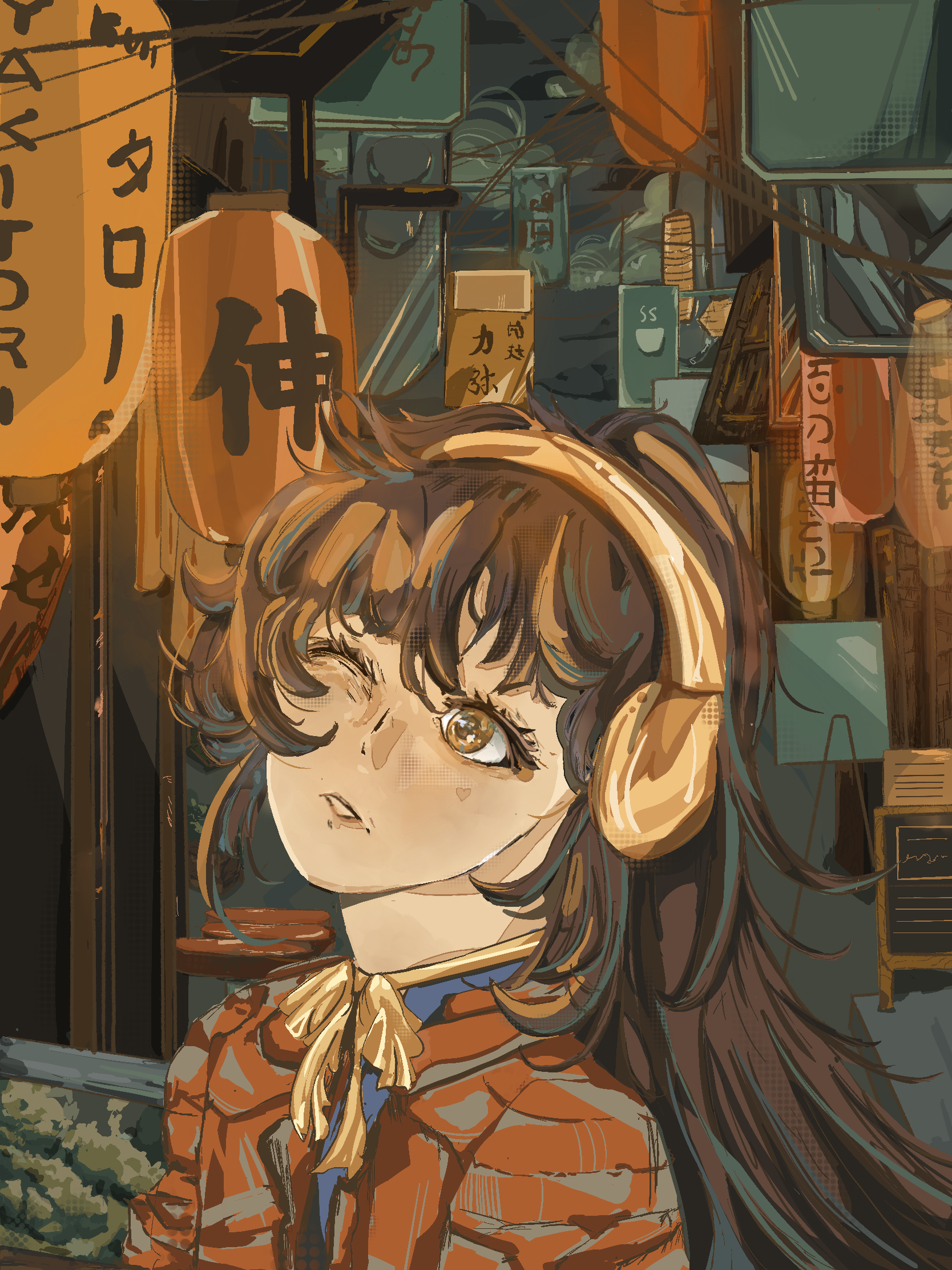
Along the way, I incorporated different techniques. I used the golden ratio for the composition to surround the girl and guide your eyes to her face and the title. In terms of technicalities, I used multiple references from Pinterest to mimic Tokyo streets, and used multiple brushes in this process, namely, the syrup and dry ink brush as well as halftones on procreate. For colors, I used complementary colors blue and orange to fit the overall vibe of the muted but busy street, these colors are almost always used for promotional art, its an artists favorite combination of colors and can be used in many ways.
I settled on 3 final outcomes, a simplified version, a complex version and one with a variation of the expression. I had a hard time choosing what I would use for the magazine cover and decided to use the second one as it conveyed the style I wanted it to as well as the complexity to entice the viewer. In addition to this, the singular eye looked like it was looking up at the masthead and closing their second eye due to the brightness of their surroundings, an interesting composition to peak a passing viewer's curiosity.
.png)
.png)
ANALYSIS AND EXPLANATION:
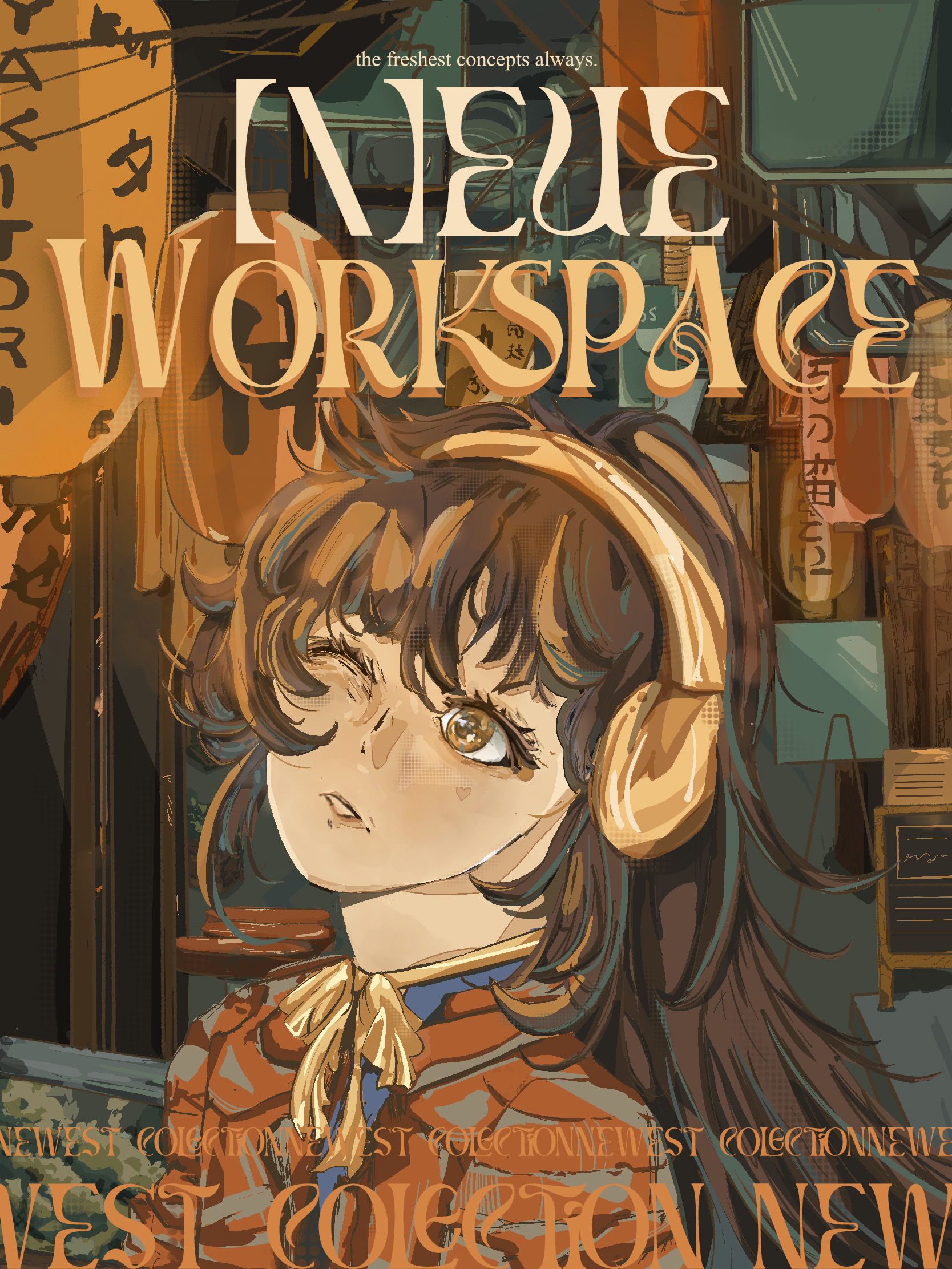
In the end I put a masthead and cover lines, this step separates the portrait as an art piece from a real magazine and distinguishes it as such. I created 4 variations, again indecisive as to which would make the user experience the art piece best, but chose the last one. It seemed like the best choice as the Japanese text almost acted as a frame for the main subject and helped guide the eyes of the viewer to her rather than the busy street surroundings, it almost worked as a canvas frame in that way. Alternatively, I could have chosen the asymmetrical third choice as it had the same effect. The choice of placing for the text is special, I used references from other magazines to see their placements, some being messier than others. For this magazine I wanted to adopt a cleaner yet alluring cover for the potential consumers so rather than choosing to follow conventional coverlines I used different placements that would follow the rule of thirds, there are three sections in the cover, the main masthead, the middle coverlines (or in the first variation, an empty space,) and the final cover lines on the bottom which are supposed to mimic interesting billboard signs. The rule of thirds balances the piece and gives it proportions to make it seem equal and clean. This juxtaposes the wild, elegant craziness of the content being said.
Speaking of which, all of these techniques are used to keep the viewers eye on the cover longer than they should and keep them thinking of it, almost as though the magazine acts as free publicity for itself. The "N" being spelled with "[\]" is for branding and it is weird and different (also intentional as this is what I want my brand to be known as), furthermore "[\]" is a reference to programmers as my target audience are creatives, a portion of which are programmers, whilst maintaining interest and curiosity for other viewers, when my mom first saw this she asked me "why does the N look like that?'' This is how I know my cover is pulling in curious people and my target audience. If a person doesn't realize this is an N, that's even better as they would have to dig through their reserve of words to match this word to the word "neue" or new, it gets their brain working and thinking deeper into the innocent wording. The slogan "the freshest concepts always" immediately gives an explanation of why the "N" is "[\]" and the small lowercase letters help contrast and balance the large title. It also gives an explanation as to why the word "new" is "neue" a common trend in fancy brands, and is inherently a "fresh concept" as it started being used frequently for brands in the 21st century but is also a direct synonym to the word "fresh" and describes a "new workplace" this has multiple meanings as well one could juggle all these meanings in their head to decipher what exactly the title means; is it referring to the magazine itself, as in the magazine is a metaphorical workspace with all the art it holds? or does it describe workspaces as a brand by itself? This keeps the viewer thinking and staying longer to view the piece. To add to this, the orange shadow, gives depth to the words "WORKSPACE" this was to give more depth to the letters, as if they were popping out of the page, but also follows the perspective of the art, an alleyway that pushes outwards to the subject, "WORKSPACE" follows this perspective while giving the model somewhere to look at.
Moving downwards, as mentioned before, the bottom text works like those billboards with moving words. I tried to replicate that style as it would fit the unconventional look I was going for, but also to match the boards in the background. Most of all, this is again to keep the eyes of the viewer on the piece longer than normal again. As people read left to right, their brain will immediately notice the way the first letters are cut off, however due to the speed of reading and how fast it is to see the continuity of the word, they will notice that it has been placed at the end, realizing this, they will most likely read it again to pair up the words. A psychological trick to encourage them to read once more and many times over as much as they want, allowing the magazine to get embedded in their mind.
Then after reading the words multiple times, or at least twice, they will notice the "mistake" in the word "collection" which is instead replaced with the word "colection" which is not a normal word. However, the singular "L" is not a typo, it is purely intentional, aesthetic and strategic, it is in fact perfectly centered in the middle, once again directly under fire of wondering eyes, it is meant to be looked at for the very same reason "newest colections" is formatted as "west colections new" to keep the viewer interacting with the magazine longer than they would. Initially, I put two "L"s, but realized that a singular L looked much better, two L's looked stranger than one in this case, it didn't break the formatting the way that "collections" did and fit the theme of "neue" concepts, unless one was really observant, their mind would fill in the blanks. If noticed, it stuns the viewer at first, as it is supposedly the last thing on the page they read and leaves them confused; "clearly the rest of the page seems professional enough, why is there a typo?" Once they see the typo, it is incredibly hard not to see it anymore as they know that there's an evident mistake. Try it. It's hard to forget. Critics and judgmental people will find this amusing and will be skeptical, even leading them to open the magazine to satiate their curiosity, this error will be addressed inside the magazine in the contents page about how it was intentional, those who may have laughed at it will be humbled, those who were curious will come to an understanding. This leaves an impression on the reader and may push them to buy the book or at least think about as they leave, before this step is accomplished they may even take a picture and send it to their friends to ridicule it, this is simply free advertising. If they post it online to ridicule, there is definitely someone knowledgeable with the information addressed in the book as to why it is like that because there always is an intellect for a piece online, it humiliates the original poster, and leaves an impression on people reading the post, some of which, may move onto buying it in curiosity. Perhaps to see it for themselves. Free advertising. Finally, when they have come to the end of their train of thought, they would need to find the reason of why it is like that and will start searching for the reason from the cover in front of them, this all leads back to the slogan "freshest concepts always.'' At the very beginning, if they have realized this connection, it loops and they are encouraged to read it all over again to connect the pieces and see it in a new light, but also makes them feel empowered as though they have solved the reasoning of the artist's intent. It all goes full circle. Regardless, for an average brain this entire thought process happens within mere seconds, some interpretations will be different and completely neue, for others they may only notice fragments of meaning and search if they were correct, via online, and whether you pass by it, or buy it, it leaves an impression, and leaves people thinking about it even after they've stopped interacting with it.
As you can see, the choice of fonts deviates from the ones I have discussed before, mostly due to how boring monotonous the previous fonts seemed, it didn't quite encapsulate the vibrance I wanted the magazine to have, I wanted it to be louder to match the image behind the text so I searched for unconventional fonts, fonts that people have recommended. It was quite hard to find the level of graphic design I wanted from a quick google search, so I retreated to reddit. Reddit, though, has a lot of information and it can be too hard to swallow all of the options. I needed a way to narrow it down. So I ventured social media, Instagrams searching feature isn't the best, that left me in TikTok, under the search of "graphic design" fonts I found many like minded people, different graphic designers with varying levels of expertise to share fonts that they've found, which is where I found "Brams", along with a few others, I found it interesting and worthy of my magazine, so I used it contently. The swirls and style is exactly what I wanted for this piece. I am incredibly happy with how it elevates the original photo by adding some personality with its font. Playful but still professional and pretty, and very much like the styles graphic designers and creatives relish in, my target audience.


%20copy.jpg)
vert%20copy.jpg)
Unfortunately, the timelapse file of me editing on Photoshop was corrupted but overall, I'm pretty happy with how it turned out. This piece was a few levels below what I had imagined, mostly due to the skill barrier and my lack of anatomy knowledge, however I am pretty proud of this piece as it is the first time I have ever drawn a human as the subject of a piece. I'm really glad I was able to take it this far.