2PS 1: Health Sport Magazine
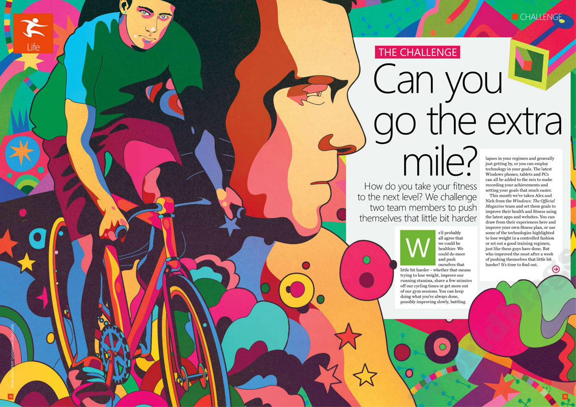
Title of article: “Can you go the extra mile?” are in sans serif text, spread across in an irregular, abstract fashion to stave away or make room for the overlapping elements. This, tied with the illustration of the man on the bike, gives a very energetic and empowering display of endurance and perseverance.
Text: The texts below the title are quite loose and informal in sans serif and share similarities with the title in terms of its features. However, the texts in boxes are tightly packed, in a smaller serif font. This introduces an element of professionalism and maturity as having smaller font tends to be directed to an older audience that can comprehend the many words, aiding the informative contents written.
Colors: The colors are bright and vibrant. All colors are quite saturated and rich in hue, further pushing the energetic theme, as if to share or spread that energy through the page, it makes the viewer feel excited and upbeat. This helps set the loose and informal tone the magazine aims to produce. This retro style is achieved by limiting the color palette to an array of bright colors.
Images: There aren’t any images in this piece, it’s mostly littered with elements and illustrations, something I too would like to have in my magazine. The elements overlap and are spewed in an organized mess, although the magazine is loud, it clearly guides your eyes to the illustrations of the man and the embedded but evidently anomalous wall of white in a sea of color.
Layout: In terms of layout, it’s quite messy and purposefully chaotic. Consequently, there isn’t a sense of formality, outside the size of the text, rather a more informal and lively positive mood created by the boisterous layout.
Overall theme: Within this spread, all the attributes create this resounding theme of loud, happy and, with lack of a better word, energetic. Every color, illustration and etch screams through the page invitingly, and is made in such a way to push your vision to the contrasting black text over white box to rest from the loudness of it all.
2PS 2: Informative Scientific Magazine
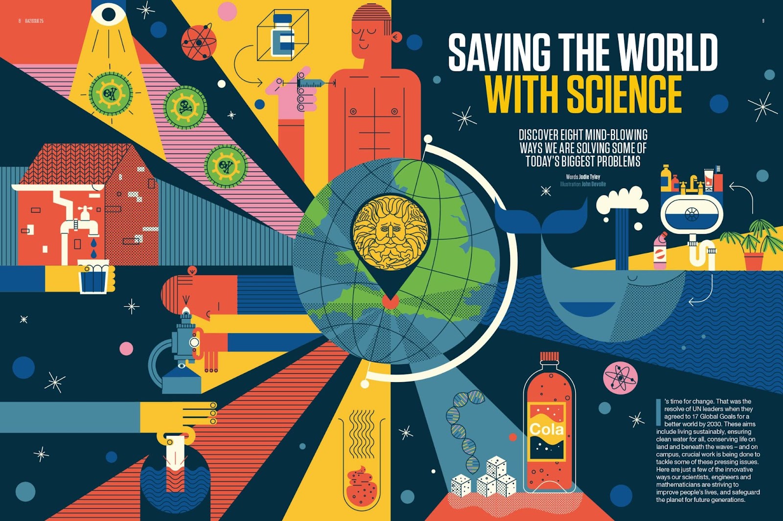
Title of article: “SAVING THE WORLD WITH SCIENCE” is in a large sans serif font, the words “WITH SCIENCE” flaunting a yellow color. The spread does a good job of clearly displaying the title due to its size. The main goal is clearly to inform, and the choice of fonts follow suit, it neither displays formality or informality, the font is neutral and consistent, fitting well with the theme of the spread.
Text: The text is also neutral and consistent in terms of font choice, there aren’t particular highlights nor are there out of place or outstanding words. This was purposefully chosen in order to not take away from the beautiful graphics or make the spread unpleasantly loud or inconsistent.
Colors: The colors are warm with a spectrum of orange and blue tones as primary colors for this piece, yellow and green act as accent and secondary colors to emphasize the existing blue and orange tones, yellow more than green. White and hints of black, plays as a neutral color that ties the varying colors together and gives them purpose, the most noticeable demonstration of this is the ray that displays sugar and cola, wherein white and black play their part to give meaning and make the graphic design cohesive. These colors are quite easy on the eyes, a range of mid tone to dark colors, the lighter colors are evenly balanced by the darker values, allowing information to be quickly absorbed by the viewer.
Images: As usual, there are no images, just illustrations and graphic design elements. I think this is most fitting for a scientific spread attempting to inform, as it presents all the information in a very easy way to interpret.
Layout: The layout is formatted in an organized, digestible manner. All clear and to the point, it’s simple and easy to understand immediately after laying your eyes on it. The elements are separated by colored rays that originate from the globe in the center of the page.
Overall theme: The overarching theme in this spread is playful and informative science. Overall, the graphic design and elements are simplistic and uncomplicated, but the combination of said elements make up an engaging ostentation, pulling the viewers in to explore the individual caricatures that make up the overall pleasing aesthetic.
2PS 3: Fun Entertainment Magazine
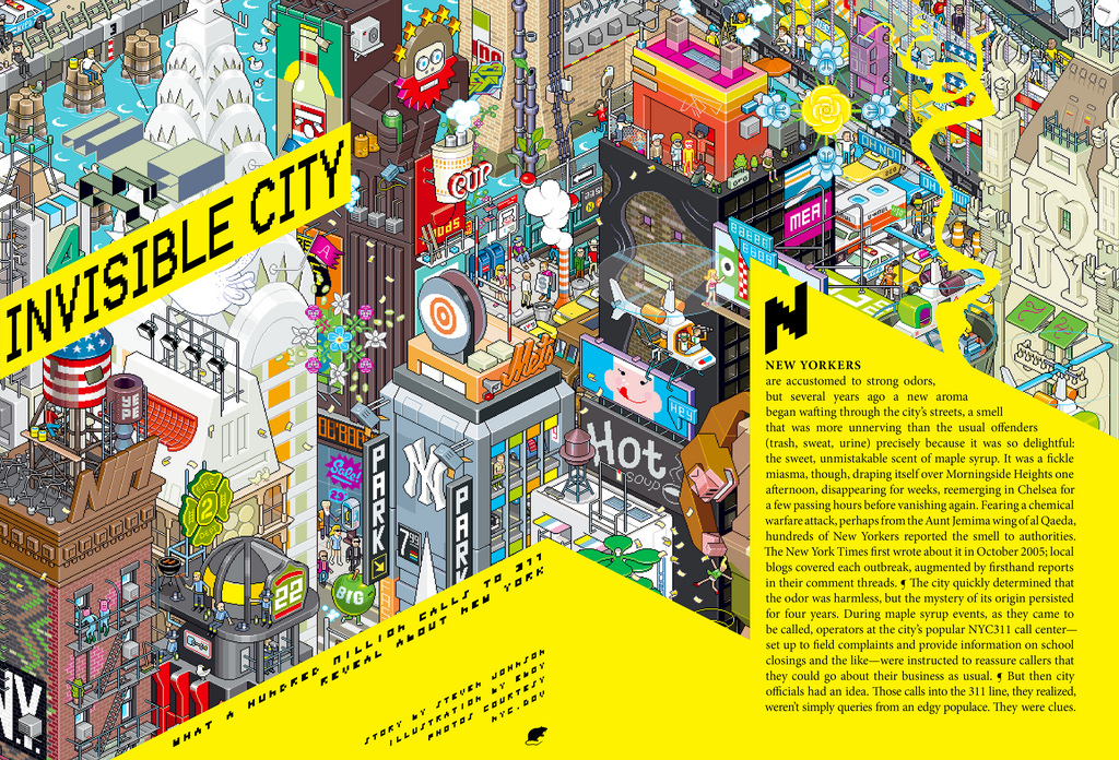
Title of article: “INVISIBLE CITY” is in a serif text, albeit quite pixelated due to the style and art. This contributes to the pixel, retro game theme. The text is black on top of a highlighter-yellow text box so it doesn’t get lost in the background. It’s smartly slanted to parallel the bending of the magazine, it’s also used to create a layer of depth by placing a 2d plane on a 3d space, as if it was the floating subtitled text overlaid on an active and live scene.
Text: The texts in the same font as the title, in the same style, with the words on top of yellow walls (text boxes) to create a 3d feel. The body text defies the rule of aligning with the direction of the yellow walls to maintain readability despite damaging the continuity of the style.
Colors: The colors don’t follow a certain scheme or pattern, it’s a wild array of muted and vivid colors that battles the blinding brightness of yellow. The yellow and black, which are normally a good pair, are high in contrast with this particular style, even though this proves to improve visibility of the text, it can be an eyesore. A better alternative might have been black background over white text, though, admittingly, this would alter the type of style currently being used.
Images: Although I am not sure of the art style, it is somewhere along the lines of isometric and pixelated art. It is a single design with many references to major New York and American media and culture.
Layout: The layout is hard to label, it’s a dynamic scene with text used to describe or help the viewers navigate the area before them, potentially using the picture as reference.
Overall theme: The theme as stated before, is retro and game-like, an undertone of playful and chaotic energy is set through the different clashing colors.
2PS 4: Simple Fashion Magazine
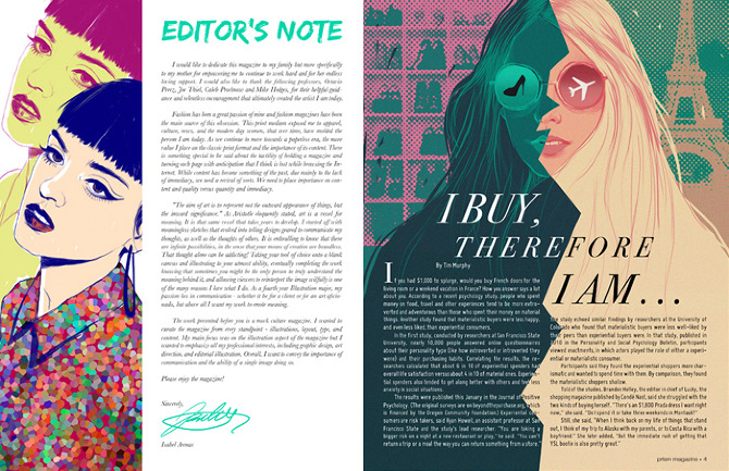
Title of article: “EDITOR’S NOTE” is sans serif font, the title for the next page “I BUY, THEREFORE I AM…” is in sans serif. The difference in fonts creates this dynamic range, it is used to isolate the content of the pages and show that they are two completely unrelated, as well as settling for a very approachable, but poignant look.
Text: The main text contrasts the titles, the body text will be sans serif when the title is serif and vice-versa. This is commonly used in design as it helps establish hierarchy on the page, however this is quite a basic and safe rule to use. There isn’t anything particularly interesting or eye-catching. On one hand, it could be used to not take away from the adjacent images, as a counterbalance so that viewers don’t get too overwhelmed with everything on the page. Alternatively, this may have been a decision to contribute to the overall theme of professionality and maturity; there’s a signature to add a layer of professionality, as though the following text is worthy enough to be reviewed and edited, the texts are small, implying that an older audience may privy to the type of magazine this is.
Colors: The colors are a mesh of yellows, pinks, greens and purples. Pinks and greens are typically used as they are a good pairing, especially when picked within similar shades. These colors set the foundational theme of stylish, cute and feminine.
Images: There are only two images, both of which are of a woman, this contextualizes the text through visual assurance directed towards the type of person they expect to read this, assumedly young, fashionable women and girls.
Layout: The layout is confusing, though there are colors and blocks for layout, and are used to separate all the texts and content, it is used poorly and generically. The colors are used to separate paragraphs on page two, the text spills to the other side, which is visually unpleasing and, personally, bothersome. There is no real continuity, although you can argue that these different ways of approaching the layout for the separate pages are used to help aid the reader in noticing the segregation of content, from my view it looks like there isn’t any consistency to helps bridge the pages together.
Overall theme: My first impression of this was a pretentious magazine, it tries to insinuate its professionality and give off a sophisticated formal ambience. I feel as though the colors, particularly the out of place green for the title look sloppy, especially paired with the font, on top of the white background. There is an overflow of words on the second page, which, although normal in many other magazines, does not work for this particular page as the text seeps through the separator colors, which can be dismissed for the title, but doesn’t work for large body texts. It makes it look very disorganized and hard to read. The usage of spacing for the “Editor’s Note” is also poor as there is too much space on the bottom and hardly enough padding for the title to breathe. The colors are a mess, although fitting to a certain range of colder colors, there isn’t a single shade on the first image that is on the second, and the green title further messes up the balance instead of attempting to find a mid value. There are four different fonts, there should be a maximum of 2, possibly 3, this, along with the mess of colors is overwhelming and looks quite amateur.
Due to the following problems as well as other inconveniences, it's hard to pinpoint an overall theme. It tethers both girlie and youthful and mature and professional, not quite electing for one or the other, making it look incredibly novice.