Brand Identity
Brand Identity is what a brand wants to convey itself to be, what it wishes to appear like in the public eye. The brand revolves around the identity to maintain consistency that parallels the brand.
For this example, I am using Apollo, an art magazine as this particular brand likes to present itself as neither classy nor completely unsophisticated.
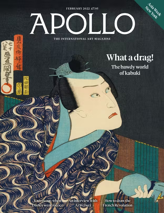
The first factor in the persona of Apollo is seen as quirky, intriguing and bizarre. They achieve this through the content they use, typically irregular shapes, strange color combinations and layouts that don’t really seem exceptionally posh or overly extravagant. Other times, they don’t incorporate any of those elements and focus on the overall layout, like the first magazine cover; all shapes are regular, they are just fused so that it looks different from what others are used to. This is just one way they attract customers, by hooking them in with something unusual and waiting for those who get curious.
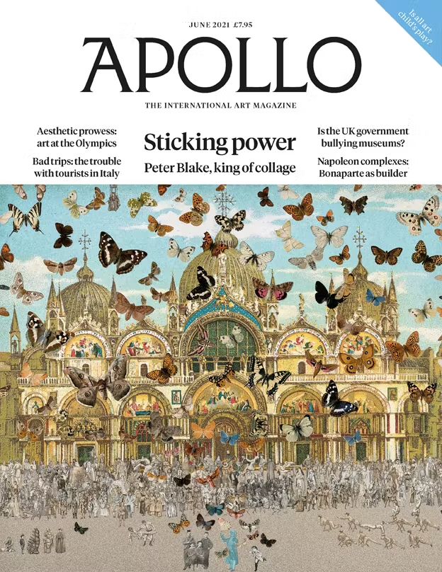
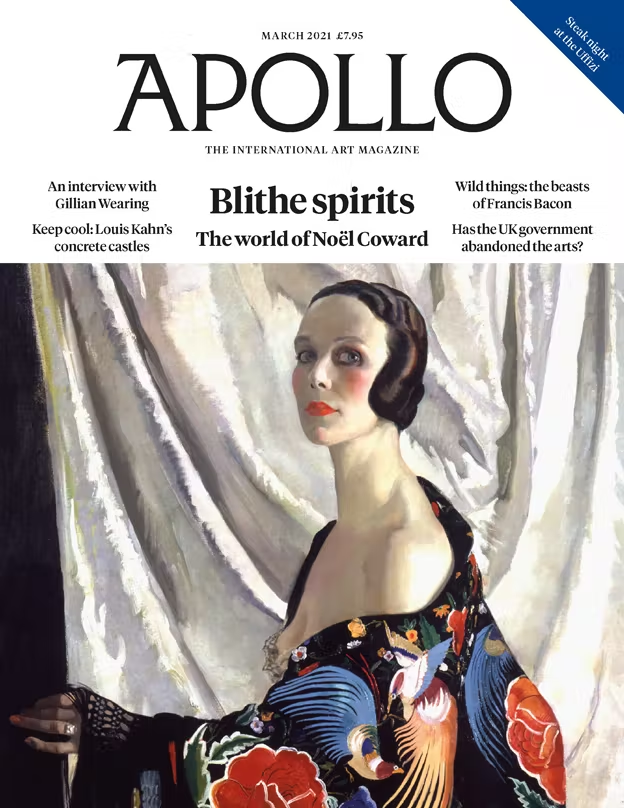
Secondly the other persona of Apollo is the opposite: refined, fresh, but exceedingly and elegantly expressive. This is their more stylish and dignified side, you can sense this through the serif fonts chosen and how it’s laid out somewhat maturely, as if targeting an older audience. This is prevalent in the second two examples shown, the content is artistic, but also very modest and sophisticated. This is shown through the empowering woman and the muted, beautiful art that isn’t messy. It’s very traditional and it isn’t childish but it is less classy than it could be, it still preserves the sophisticated-but-not-exactly-over-the-top impression.
With these factors combined, Apollo presents itself as welcoming without coming off as overbearing. This is good for attracting their target audience, which seems to be veteran artists or artists that are actively looking for material.
Language Analysis
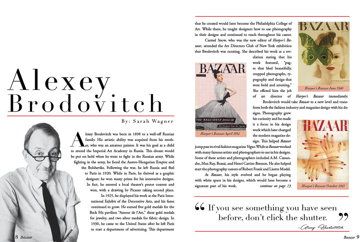
Here, I chose an artistic, heavy text-based example to analyze. The article looks lengthy enough to split between two pages. However, this is an illusion, although it seems to be quite long, lots of space is used by the images, this deceives you into thinking that it's worth two pages, when in actuality the text might be worth one page, here the paragraphs are split in half and then spread on the two pages. This may be so that people would think there is extensive content on this subject, leading them to believe that it is more professional than it actually is.
The size of the font is small, but read-friendly this shows that it targets older audiences, but can still be classified as a casual read. This very much addresses the topic without addressing it to you, it speaks in the third person rather than directly at the reader as this is his biography. In terms of language, the vocabulary is basic and allows anyone to understand the aspects of his life well. There are a few technical phrases but it’s overall easy to comprehend for those at least over the age of 11. Aside from this, the text is formal, as there is no sign of colloquial slang or informalities. It isn’t overly formal either, just enough to inform of his life.