Overview
ARTnews magazine is one of the longest running art magazines in the realm of art magazines, due to this it is known as a trusted source of art criticism and news in the industry. After 113 years, ARTnews has ceased monthly publication and instead continues digitally, releasing quarterly issues.
One of the biggest reasons I decided to annotate and analyze this specific magazine is due to its conformity and popularity. During this analysis I tried to find whether the magazine covers contribute to the brand’s popularity, or if people buy their magazines solely for its renowned reputation and brand trust.
ARTnews target market are veterans and seasoned artists in the art industry that yearn to read and understand art criticisms for certain arts or to broaden their knowledge of art. As such, they try to attract artists with the various art styles and pop colors that would typically attract this target audience.
Layout and Style
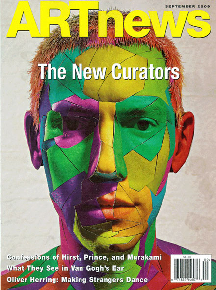
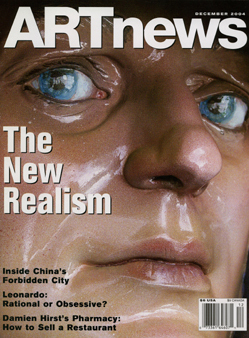
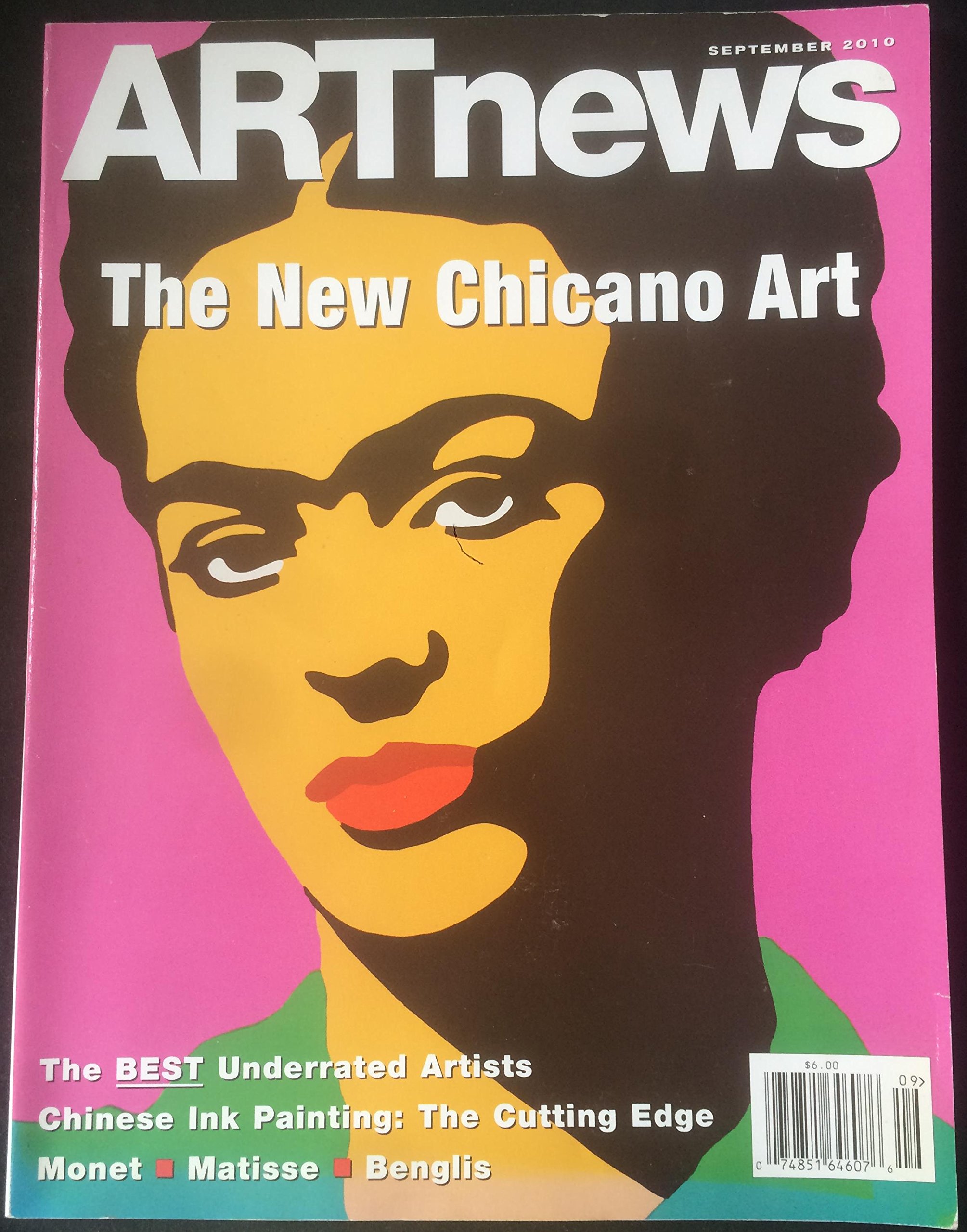
When annotating, the standardized layout becomes very obvious. Each magazine contains a large bold and bright masthead, in a light color, usually white sans serif, below it a subheading. Surrounding the main image are extra details, coverlines, as if to frame the image and center the art, like how traditional canvases are framed and placed on a wall. In all magazines, the cover contains a barcode as these magazines were most commonly bought in stores.
In terms of style, most ARTnews magazines use soft colors in an 80s-esque fashion, the color palette typically tends to be hues of pink, greens and yellows as well as natural tones, in terms of color theory, they use split complimentary from the RYB color wheel. This is eminent as this bright color scheme is known for bringing joy and happiness. When these joyful colors are mixed they bring livelier and blissful colors, in using this color scheme they attempt to attract others with the bright and happy colors.
Analysis
The main images typically contain known historical figures, or art of people, usually depicting styles of art that encapsulate the subject's features and qualities, although it’s quite plain and filled with pale colours.
Coverlines surround the page at a controlled and minimal amount, as if to not take away or completely obstruct the view of the article, thus to hold up that luxury art reputation. The fonts used for most of these coverlines as well as the mastheads are sans serif, to maintain the clean and minimalistic approach of the magazine.
This magazine gives a sense of one-way communication, there is visibly no way of interacting with it, no promos or any particular rhetorical questions that engage the viewer. This unrequited communication suggests that ARTnews is solely an informative magazine rather than a consumer two way friendly interaction.